
There is a specific kind of paralysis that hits when your workspace stops working for you. I know it well. I have sat in front of a 27-inch monitor in my Brooklyn studio with reference folders open in twelve windows, a sketchbook buried under a stack of printouts, and absolutely no idea where I put the Wacom pen I was holding two minutes ago. The physical environment of a creative space is not a background detail. It is either fuel or friction, and most of us spend years figuring out the difference. That is what pulled me into this CreativeLive studio tour with Blair Stocker, a craft book author and teacher who has spent over a decade refining a basement workspace into something genuinely purposeful. Watch the full tutorial on YouTube
What Blair walks through is not a glamorous renovation reveal. It is a working professional showing you how she thinks about space, storage, and the psychology of creativity. I do not make quilts. I build composite images for movie posters and album covers. But the logic she applies translates directly, and I came away with three changes I made to my own studio the same week I watched this.
Step 1: Accept the Constraints of Your Space First
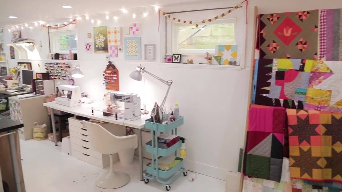 Blair introducing her basement studio and its lighting challenges
Blair’s studio is in a basement that used to be a photographer’s darkroom, which means natural light is genuinely scarce. Rather than framing this as a problem she failed to solve, she frames it as a condition she designed around. There is a brief window around 2 p.m. when light floods in for roughly fifteen minutes. She knows this. She plans for it. The rest of the time, she works with artificial solutions.
Blair introducing her basement studio and its lighting challenges
Blair’s studio is in a basement that used to be a photographer’s darkroom, which means natural light is genuinely scarce. Rather than framing this as a problem she failed to solve, she frames it as a condition she designed around. There is a brief window around 2 p.m. when light floods in for roughly fifteen minutes. She knows this. She plans for it. The rest of the time, she works with artificial solutions.
This matters because most creative workspace advice starts from ideal conditions. Real studios rarely have ideal conditions. I work in a converted bedroom with one north-facing window. When I stopped fighting that and started understanding it, my setup got better. Before you move anything or buy anything, map your actual light, your actual power outlets, and your actual traffic patterns. Design from truth, not aspiration.
Step 2: Dedicate Zones to Specific Types of Work
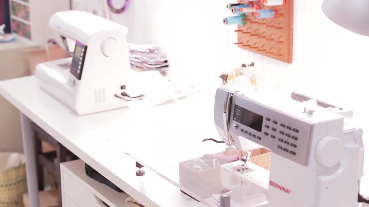 The sewing area with two machines set up and ready to use
Blair’s studio has a clear sewing zone anchored by two machines, each assigned to a specific user and purpose. One belongs to her daughter for garment sewing. The other, a Bernina 550 with an extension table and a knee lift bar, is her primary quilting machine. Nothing about this is accidental. The extension table exists because quilts are large and a flat surface reduces drag on the fabric. The knee bar keeps both hands on the work.
The sewing area with two machines set up and ready to use
Blair’s studio has a clear sewing zone anchored by two machines, each assigned to a specific user and purpose. One belongs to her daughter for garment sewing. The other, a Bernina 550 with an extension table and a knee lift bar, is her primary quilting machine. Nothing about this is accidental. The extension table exists because quilts are large and a flat surface reduces drag on the fabric. The knee bar keeps both hands on the work.
The principle here is that friction-free work requires dedicated setup. If you have to reconfigure your station every time you switch tasks, you are adding a cognitive and physical tax to every session. In my own space, I keep one desk purely for sketching, no screens, no keyboard, just paper and pencils. My digital station is separate. Switching between them is a physical act that signals a mental shift. It took me longer than I would like to admit to figure out that this matters.
Step 3: Keep Emotional Anchors Visible, Not Stored Away
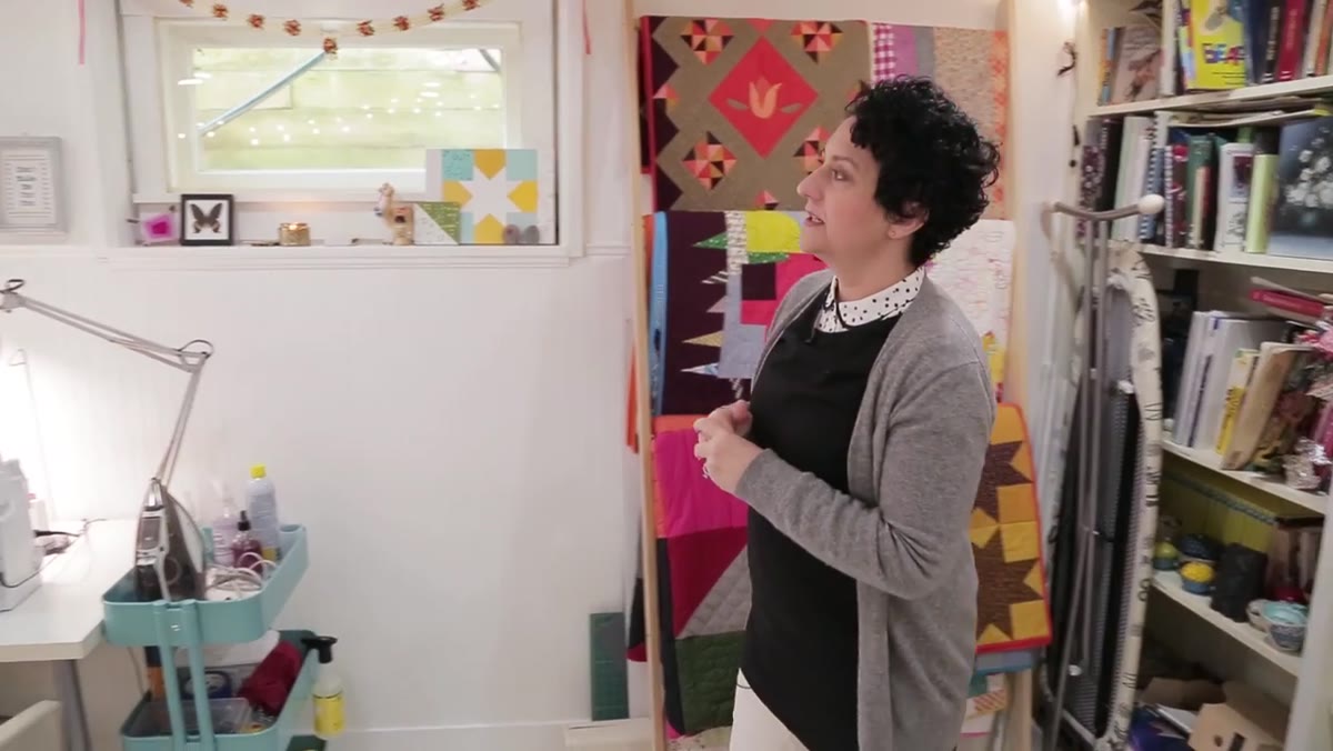 Window sills with small personal objects including a Lego sewing machine
Blair keeps meaningful objects on her windowsills: a Lego sewing machine her kids made, a hand-sewn piece her daughter left for her, old wooden thread spools, printing blocks, a Victorian pin cushion that was a gift when her book was published. These are not decorative filler. They are objects with specific emotional weight, chosen deliberately to be in her sightline while she works.
Window sills with small personal objects including a Lego sewing machine
Blair keeps meaningful objects on her windowsills: a Lego sewing machine her kids made, a hand-sewn piece her daughter left for her, old wooden thread spools, printing blocks, a Victorian pin cushion that was a gift when her book was published. These are not decorative filler. They are objects with specific emotional weight, chosen deliberately to be in her sightline while she works.
I have a folder on my desktop called “failures” that I review monthly to track my growth. I also keep a framed print of a composite I made early in my career where the shadow on the subject’s face runs in the wrong direction. Everyone missed it but me. Both things, the failures folder and that print, do the same thing Blair’s windowsill objects do. They keep you connected to the full arc of your work, not just the deadline in front of you. Curate what you see when you look up from the task.
Step 4: Organize Supplies by How You Actually Reach for Them
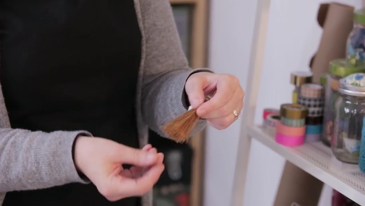 Drawers and containers showing thread, trims, paints, and beading supplies
Blair’s supply storage is organized by medium and frequency of use. Thread she reaches for constantly lives close to the machine. Paint brushes and acrylics, used occasionally, are stored together but farther away. Beading supplies, specialty items, are grouped in their own dedicated area. She also repurposes unexpected containers, including old salesman sample cases that now hold English paper piecing supplies.
Drawers and containers showing thread, trims, paints, and beading supplies
Blair’s supply storage is organized by medium and frequency of use. Thread she reaches for constantly lives close to the machine. Paint brushes and acrylics, used occasionally, are stored together but farther away. Beading supplies, specialty items, are grouped in their own dedicated area. She also repurposes unexpected containers, including old salesman sample cases that now hold English paper piecing supplies.
The organizing logic is not alphabetical or categorical in a library sense. It is kinetic. Supplies live where your hands naturally go when you need them. This is something I rebuilt my brush preset panels around years ago. The tools I use on every composite are one click away. Specialty brushes I use once a month are two folders deep. Audit your storage not by what makes sense on paper, but by what you actually reach for and how fast you need it.
Step 5: Build a Design Wall for Distance Evaluation
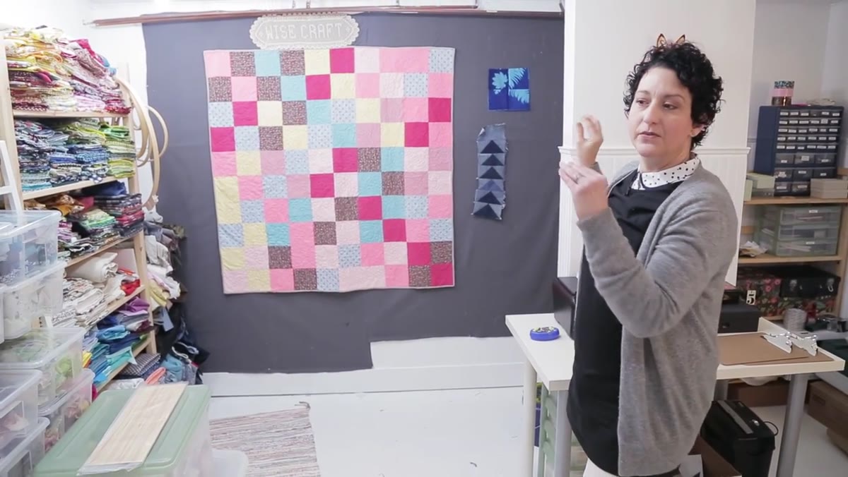 Flannel design wall with quilt pieces arranged for visual assessment
Blair’s design wall is flannel fabric mounted to a wall surface. When she cuts quilt pieces, she can press them directly onto the flannel without pins. The wall exists specifically so she can step back and evaluate composition from a distance, something impossible to judge when you are holding the work in your hands.
Flannel design wall with quilt pieces arranged for visual assessment
Blair’s design wall is flannel fabric mounted to a wall surface. When she cuts quilt pieces, she can press them directly onto the flannel without pins. The wall exists specifically so she can step back and evaluate composition from a distance, something impossible to judge when you are holding the work in your hands.
Every composite artist needs a version of this. I do not mean a literal flannel wall. I mean a mechanism for seeing your work at a distance and at reduced scale. I regularly export a low-resolution flat of whatever I am building and look at it on my phone across the room. Scale and distance reveal proportion problems and lighting inconsistencies that disappear when you are zoomed into a layer. Build the habit of stepping back deliberately.
What I Would Add From My Own Practice
Blair’s studio tour is built around the physical organization of tangible materials, which is exactly right for her work. For anyone working digitally, I would extend her zoning logic into the file system itself. My project folders mirror my physical zones: reference, sketches, source assets, working files, finals. The structure of the folder is the structure of the workflow. When a project folder is chaotic, the work usually reflects it.
I also sketch every composite on paper before opening Photoshop. This maps directly to Blair’s design wall principle. If you cannot draw the idea with a pencil, you do not understand it well enough to build it yet.
The single most important thing Blair demonstrates is not a specific tool or storage solution. It is the discipline of designing your environment with intention, then letting that environment reduce the friction between you and the work. Everything else follows from that.
Watch the full tutorial on YouTube and pay attention to the reasoning behind each choice, not just the choices themselves. That is where the real instruction is.
Comments (5)
Clear and practical. No fluff. Appreciate that.
Printing this out and pinning it next to my monitor. That good.
Love how you break down complex stuff into manageable steps.
My workflow just got 10x faster. Not even kidding.
This is going in my reference folder. Incredibly useful.
Leave a Comment