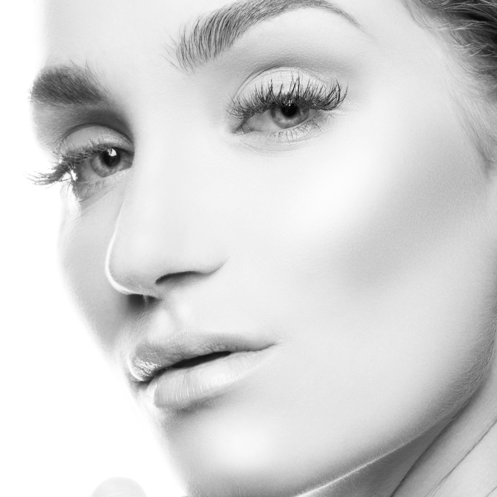
I once spent forty minutes on a mask that covered maybe thirty pixels of image. It was a strand of hair crossing a bright window in a book cover composite, and the author’s photo had been shot against a gray studio backdrop. Nobody was going to zoom in on that strand. The art director certainly wasn’t going to. But I knew that if I left it soft and haloed with gray fringe, some part of my brain would register it as wrong every time I looked at the final piece, even if I couldn’t articulate why. So I sat there, with Hans Zimmer playing through my headphones, painting pixel by pixel until the hair read as real.
That’s the thing about masking. The failures are almost never obvious. They’re cumulative. Ten slightly wrong edges in a single composite don’t give you ten mistakes. They give you one image that feels fake and nobody can explain why.
Why Bad Masks Fool You in Isolation and Fail in Context
A mask is just a grayscale image that controls transparency. White reveals, black conceals, gray is semi-transparent. You probably know this already. But knowing the definition and understanding the behavior are different things.
The problem most compositors run into is that they evaluate their masks in isolation. They zoom to 200%, check the edge, it looks clean, they move on. Then they drop the masked element onto a new background and something is wrong. The subject looks pasted. It looks like a cutout.
What’s happening is an edge contamination problem. When a camera photographs a subject against a background, the lens slightly blurs the boundary between them. The pixels along that edge are a mix of subject color and background color. You can’t see it at a normal view, but it’s there in the data. When you cut that subject out and place it on a new background, those edge pixels are still carrying the color information of the original backdrop. A dark studio background will leave a dark fringe. A bright window will leave a light halo. The mask itself can be technically perfect and you’ll still have a composite that looks wrong.
The Minimum Workflow: Refine Edge, Decontaminate, Then Paint
In Photoshop, the fix starts with Select and Mask (the dialogue that replaced Refine Edge in CC 2015, though the logic is the same). After making your initial selection, go to Select > Select and Mask. Set your View Mode to On Black or On White, whichever is opposite your subject’s dominant tone. Use the Refine Edge Brush tool with a radius of 3 to 5 pixels for most subjects, larger for fine hair or fur.
The single most underused checkbox in that dialogue is Decontaminate Colors, in the Output Settings at the bottom. Set it to between 50 and 75 percent. What it does is sample the edge pixels and shift their color away from the background tone and toward the subject’s interior color. It’s not perfect, especially on very fine detail, but it removes the majority of fringe contamination automatically. Output to a New Layer with Layer Mask, not a flattened selection.
After that, the work is manual. I add a Curves adjustment clipped to the subject layer and push the midtones slightly to match the light of the new scene. Then I paint on the mask itself with a soft brush at 10 to 20 percent opacity, at a brush size that’s roughly twice the width of the area I’m refining. I’m not trying to move the edge. I’m softening or sharpening the transition so it matches how the lens in the background plate would have rendered that edge at that distance.
The Light Doesn’t Lie, But Your Layer Stack Might
Here’s where most tutorials stop, and where most composites quietly fall apart. Getting a clean edge only solves half the problem. The other half is matching the quality of light between your subject and your background.
Every photograph has a specific contrast ratio, color temperature, and light direction. If your subject was shot in a controlled studio at 5500K with a single softbox at camera left, and your background is a golden-hour exterior at 3200K with the sun at camera right, your mask can be flawless and the composite will still look wrong. The edge will be correct and the image will still feel like a lie.
I sketch every composite on paper before I open Photoshop. It’s a habit I developed early on, mostly to work out light direction before I commit to sourcing images. I mark where the key light is, where the fill is, where the shadows should fall. If a background image doesn’t match that sketch, I don’t use it, or I know going in that I’m going to need significant color grading to bridge the gap.
The grading happens above the mask work. I use a combination of Color Balance, Selective Color, and a single Photo Filter adjustment layer set to the dominant color of the background’s light source, usually at 8 to 15 percent opacity, clipped to the subject layer. That last step, the Photo Filter clip, is what makes a subject feel like it’s actually standing in the light of the scene rather than being photographed separately and dropped in.
When the Mask Is Perfect and the Composite Still Doesn’t Work
I keep a folder on my desktop called “failures.” I go through it once a month. Most of what’s in there isn’t technically broken. The masks are fine. The edges are clean. What went wrong was a decision made earlier, usually at the image sourcing stage, where I chose a background or a subject photo whose light didn’t match at a fundamental level that I couldn’t fully correct in post.
Masking is taught as a technical skill, and it is one. But the better you get at it, the more you realize that the mask itself is almost never where composites succeed or fail. It’s the judgment call you make before you ever open Select and Mask that determines whether all that edge work is going to add up to something real.
The mask is the last line of defense against a decision that should have been made at the beginning. Get the light right first, and the mask will have something worth protecting.
Comments
Leave a Comment