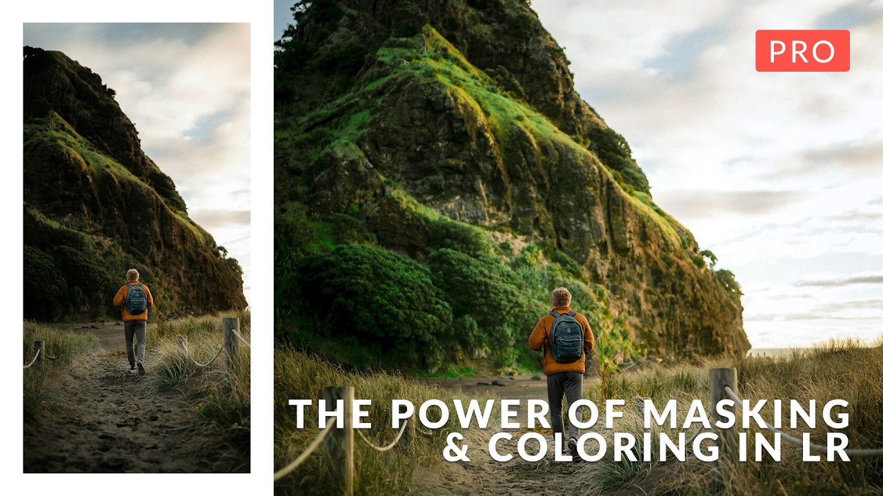
There’s a particular kind of frustration that comes from knowing exactly what you want an image to feel like and not being able to get the software to cooperate. I’ve spent years in Photoshop building composites for movie posters and album covers, and the bottleneck is almost never the creative idea. It’s selection precision. It’s isolating one slice of an image, in one specific tonal range, and pushing it without dragging everything else along with it. That’s a masking problem, and it’s the same problem whether you’re doing high-end commercial work or trying to make a portrait sing.
That’s why I kept coming back to this tutorial from Aaron Nace over at PHLEARN. Watch the full tutorial on YouTube. What impressed me immediately is that it isn’t built around a single app. The techniques translate across Lightroom Classic, Lightroom desktop, Lightroom mobile, and Photoshop. For anyone who moves between devices or works with clients who want deliverables fast, that kind of flexibility isn’t a nice-to-have. It’s essential.
What Nace has built here is a complete masking and coloring system, not a collection of tricks. Each section stacks on the previous one, and by the end you have an actual workflow rather than a bag of techniques you’re not sure how to sequence. Here’s how it breaks down.
Step 1: Orient Yourself Across All Four Platforms
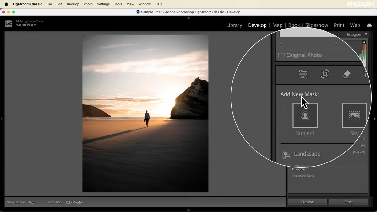 Lightroom Classic masking panel open on screen
Before any mask gets drawn, Nace walks through where the masking tools live in each version of the software. This sounds administrative but it isn’t. The same underlying logic runs through all four platforms, and knowing where to find each control means you don’t lose momentum mid-edit. In Lightroom Classic and the desktop version, the masking panel sits in the top-right of the Develop module. In Lightroom mobile, it’s accessible through the same editing panel, just reorganized for touch. In Photoshop, you’re working with a parallel set of controls that respond to the same conceptual framework. Spend time here before moving on. A confident hand on the tools makes everything downstream faster.
Lightroom Classic masking panel open on screen
Before any mask gets drawn, Nace walks through where the masking tools live in each version of the software. This sounds administrative but it isn’t. The same underlying logic runs through all four platforms, and knowing where to find each control means you don’t lose momentum mid-edit. In Lightroom Classic and the desktop version, the masking panel sits in the top-right of the Develop module. In Lightroom mobile, it’s accessible through the same editing panel, just reorganized for touch. In Photoshop, you’re working with a parallel set of controls that respond to the same conceptual framework. Spend time here before moving on. A confident hand on the tools makes everything downstream faster.
Step 2: Learn Every Mask Type Before You Combine Them
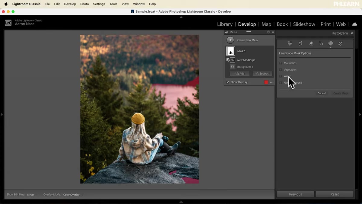
 Masking panel showing all available mask types
The foundations section covers each available mask category one at a time: subject, sky, background, object, luminance range, color range, depth range, radial, linear gradient, and brush. The goal isn’t memorization. It’s building the instinct to look at a photo and immediately know which mask type matches which problem. A subject with clean edges against a busy sky calls for a different tool than a shadow that needs to be lifted across just the midtones. Nace shows what each mask type actually selects in a real image, not just what it’s supposed to do in theory. That distinction matters a lot when you’re on deadline and the first mask you reach for doesn’t hold the edge you need.
Masking panel showing all available mask types
The foundations section covers each available mask category one at a time: subject, sky, background, object, luminance range, color range, depth range, radial, linear gradient, and brush. The goal isn’t memorization. It’s building the instinct to look at a photo and immediately know which mask type matches which problem. A subject with clean edges against a busy sky calls for a different tool than a shadow that needs to be lifted across just the midtones. Nace shows what each mask type actually selects in a real image, not just what it’s supposed to do in theory. That distinction matters a lot when you’re on deadline and the first mask you reach for doesn’t hold the edge you need.
Step 3: Understand Mask Logic: Add, Subtract, Intersect
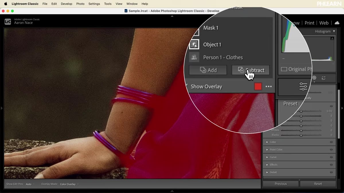 Mask intersection controls shown in editing panel
This is where the tutorial earns its “advanced” label. Individual masks get you part of the way there. Combining them gets you exactly where you need to go. Adding a mask expands your selection. Subtracting removes areas you don’t want affected. Intersecting finds only the overlap between two separate selections, which is how you do things like affect only the bright parts of a subject, or only the shadowed areas of a sky. For compositing work, intersecting a luminance range mask with a subject mask is something I now use constantly when blending a subject into an environment. The light has to match, and this is the surgical way to get it done without painting by hand.
Mask intersection controls shown in editing panel
This is where the tutorial earns its “advanced” label. Individual masks get you part of the way there. Combining them gets you exactly where you need to go. Adding a mask expands your selection. Subtracting removes areas you don’t want affected. Intersecting finds only the overlap between two separate selections, which is how you do things like affect only the bright parts of a subject, or only the shadowed areas of a sky. For compositing work, intersecting a luminance range mask with a subject mask is something I now use constantly when blending a subject into an environment. The light has to match, and this is the surgical way to get it done without painting by hand.
Step 4: Build a Complete Edit Using Layered Masks
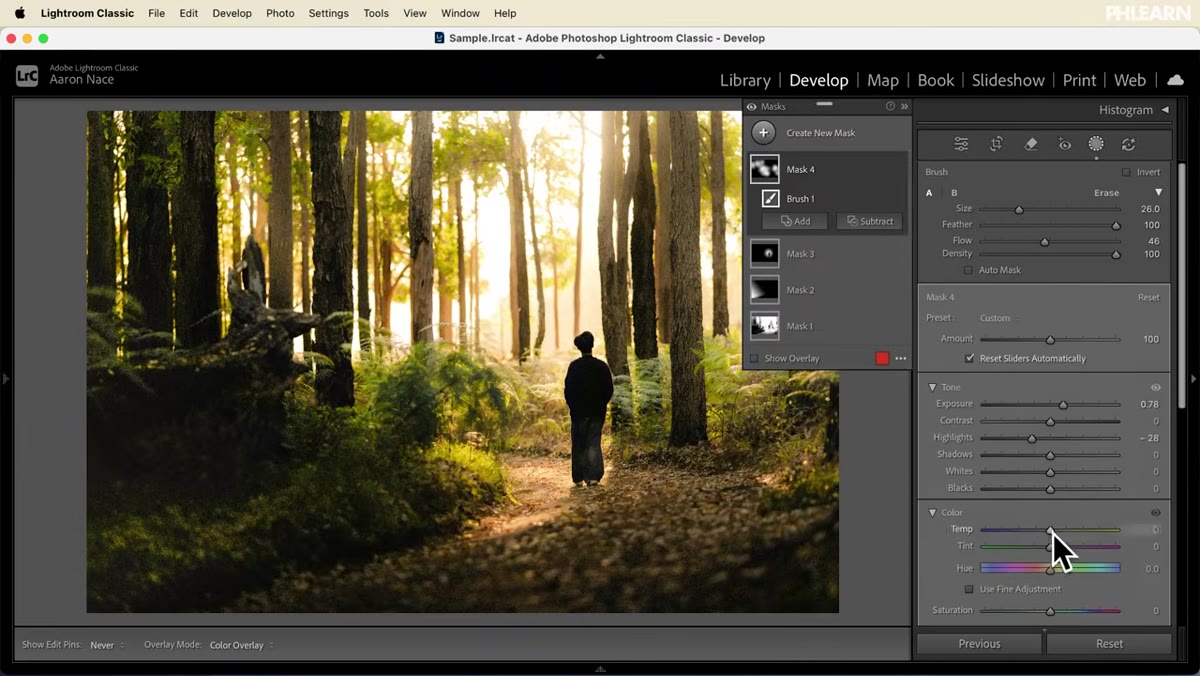
 Full image edit with multiple active masks stacked
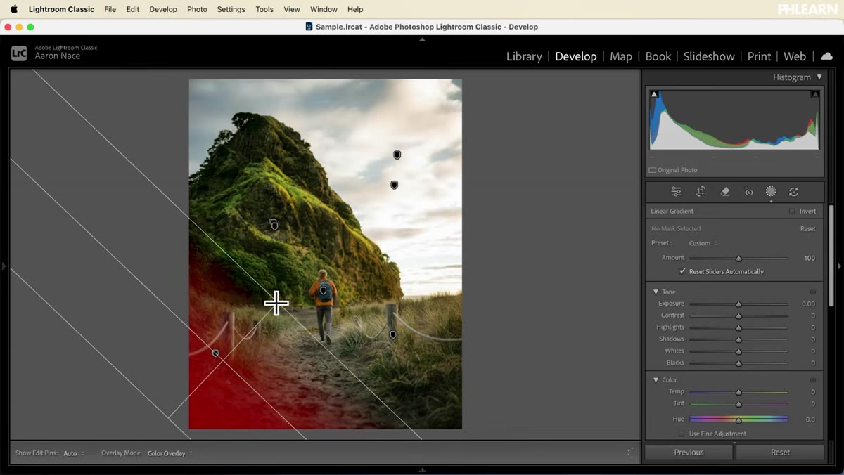
With the logic established, Nace moves into a start-to-finish edit that puts everything together. This is the section most tutorials skip or rush through, and it’s the most valuable one. He shows how multiple masks interact when they’re stacked, how editing light in one region affects the perceived color in adjacent regions, and how to sequence your adjustments so you’re solving problems in the right order. The lesson here is that masking isn’t a step you do once. It’s the scaffold the entire edit runs on. Every color decision, every tonal adjustment, works better when it’s applied to a precisely selected region rather than dropped on the whole image.
Full image edit with multiple active masks stacked
With the logic established, Nace moves into a start-to-finish edit that puts everything together. This is the section most tutorials skip or rush through, and it’s the most valuable one. He shows how multiple masks interact when they’re stacked, how editing light in one region affects the perceived color in adjacent regions, and how to sequence your adjustments so you’re solving problems in the right order. The lesson here is that masking isn’t a step you do once. It’s the scaffold the entire edit runs on. Every color decision, every tonal adjustment, works better when it’s applied to a precisely selected region rather than dropped on the whole image.
Step 5: Use Selective Color to Direct the Viewer’s Eye
 Selective color enhancement applied to masked subject area
Once the light structure is solid, the tutorial moves into coloring. Nace demonstrates how to isolate parts of an image by color range and push or pull saturation and hue independently. He pairs this with a technique I find genuinely useful: carving light and shadow to create a visual path through the frame. Darkening the edges of a scene while keeping the subject luminous isn’t just a vignette. It’s a storytelling choice. He also covers AI lens blur for background separation, which is worth understanding even if you’re going to do the same thing more precisely in Photoshop afterward.
Selective color enhancement applied to masked subject area
Once the light structure is solid, the tutorial moves into coloring. Nace demonstrates how to isolate parts of an image by color range and push or pull saturation and hue independently. He pairs this with a technique I find genuinely useful: carving light and shadow to create a visual path through the frame. Darkening the edges of a scene while keeping the subject luminous isn’t just a vignette. It’s a storytelling choice. He also covers AI lens blur for background separation, which is worth understanding even if you’re going to do the same thing more precisely in Photoshop afterward.
Step 6: Dodge and Burn Through Luminance Masks
 Luminance range mask applied to highlight region
The light and color section focuses on selecting tonal ranges rather than physical objects. Targeting just the highlights, just the shadows, or a specific midtone band lets you dodge and burn with precision that a brush alone can’t match. Nace shows how small, layered adjustments compound into a result that reads as natural rather than edited. This is the difference between a photo that looks retouched and one that looks like it was lit perfectly in camera. The principle applies directly to compositing: matching the light in a pasted element to the plate image works best when you can select each tonal range independently and shift it toward the target.
Luminance range mask applied to highlight region
The light and color section focuses on selecting tonal ranges rather than physical objects. Targeting just the highlights, just the shadows, or a specific midtone band lets you dodge and burn with precision that a brush alone can’t match. Nace shows how small, layered adjustments compound into a result that reads as natural rather than edited. This is the difference between a photo that looks retouched and one that looks like it was lit perfectly in camera. The principle applies directly to compositing: matching the light in a pasted element to the plate image works best when you can select each tonal range independently and shift it toward the target.
Step 7: Color Grade in Shadows, Midtones, and Highlights Separately
 Color grading panel with separate shadow and highlight controls
The final section covers full color grading, treating shadows, midtones, and highlights as separate creative decisions rather than one unified push. Nace also shows how to create multiple edit variations from the same image, color each one differently, and compare them before committing. This is a habit worth stealing. I keep multiple graded versions of any composite I’m developing precisely because color perception shifts depending on context, and what reads beautifully on screen at 11 PM sometimes reads wrong at 9 AM.
Color grading panel with separate shadow and highlight controls
The final section covers full color grading, treating shadows, midtones, and highlights as separate creative decisions rather than one unified push. Nace also shows how to create multiple edit variations from the same image, color each one differently, and compare them before committing. This is a habit worth stealing. I keep multiple graded versions of any composite I’m developing precisely because color perception shifts depending on context, and what reads beautifully on screen at 11 PM sometimes reads wrong at 9 AM.
What I’d Add From My Own Work
The one thing this tutorial doesn’t address directly is how mask precision compounds when you’re working with multiple source images rather than a single photograph. In compositing, you’re not just masking one subject from one background. You’re reconciling light from three or four different sources, often shot at different times of day. The masking logic Nace teaches here is exactly the right foundation for that, but the complexity multiplies. My suggestion: after you’ve run through this workflow on a single image, take two photos with different light directions and try to blend them using only these tools. The places where the workflow breaks down will tell you exactly what to learn next.
The single most important idea in this tutorial is that masking isn’t preparation for the real edit. Masking is the edit. When you can isolate any part of an image with precision, every adjustment you make lands exactly where you intend it. Everything else follows from that.
Watch the full tutorial on YouTube and follow along with the sample images Nace includes. The concepts click faster when your hands are moving.
Comments (2)
This should be required reading for anyone starting out.
Love this. I referenced a similar technique in one of my recent posts. Always good to see other perspectives.
Leave a Comment