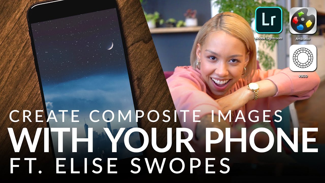
Most of my compositing work lives inside a full desktop setup: two monitors, a drawing tablet, Photoshop with a folder structure that would give most people a headache. That’s the environment where I built movie posters and album covers, and for a long time I assumed that anything less than that was a compromise. Then I watched Elise Swopes walk through her entire mobile workflow and quietly reconsidered a few things.
In this Aaron Nace (PHLEARN) tutorial, Swopes — an artist known for her dreamlike urban composites — demonstrates how she takes iPhone photos and layers them with stock sky elements entirely inside Art Studio Pro on her phone. No desktop. No stylus. No excuses. The result is a surreal cityscape with stacked clouds, stars, and a moon, all blended together with gradient masks and blend modes. The techniques she uses aren’t watered-down shortcuts. They’re the same foundational moves I use on a 27-inch screen, just executed on a 6-inch one. If you’ve been treating your phone as a capture device and nothing more, this workflow is worth understanding.
The tutorial moves quickly, so I’ve broken it into discrete steps below. Every setting Swopes uses is here. You can follow along without watching first, though I’d recommend reading through once before you open the app.
Step 1: Set Your Document to a 4x5 Aspect Ratio
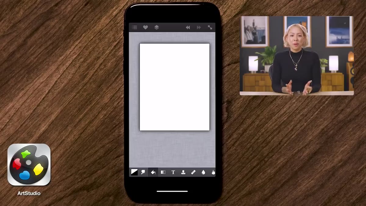 Art Studio Pro document size set to 4x5 ratio
Before importing anything, Swopes establishes her canvas at a 4x5 aspect ratio. This is a deliberate Instagram-first decision: 4x5 fills more vertical screen space than a square or landscape crop, which means more visual real estate in the feed before a user scrolls past. If you’re compositing for print or other platforms, you’ll adjust this, but for anyone building a social portfolio, 4x5 is worth defaulting to. Set your document size at the start. Changing it mid-composite forces you to re-scale everything.
Art Studio Pro document size set to 4x5 ratio
Before importing anything, Swopes establishes her canvas at a 4x5 aspect ratio. This is a deliberate Instagram-first decision: 4x5 fills more vertical screen space than a square or landscape crop, which means more visual real estate in the feed before a user scrolls past. If you’re compositing for print or other platforms, you’ll adjust this, but for anyone building a social portfolio, 4x5 is worth defaulting to. Set your document size at the start. Changing it mid-composite forces you to re-scale everything.
Step 2: Import Your Base Photo as a Layer
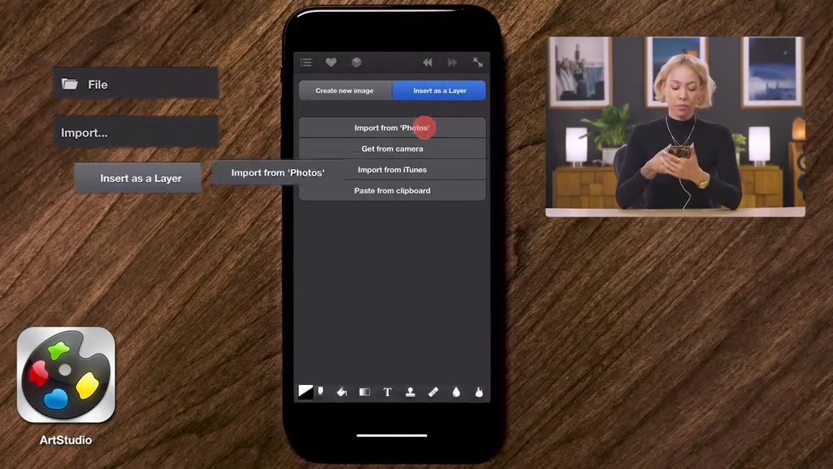 File import menu showing “insert as layer” option
This is the step most beginners get wrong the first time. In Art Studio Pro, there are two ways to bring in an image: importing it as a new document, or importing it as a layer inside your existing canvas. You want the second option every time. Navigate to File, then Import, then choose “Insert as Layer.” Importing as a new photo replaces your canvas entirely, which means you lose your document dimensions and have to start over. Once your base iPhone photo is in, use Edit, Transform to position and scale it so it sits correctly within the 4x5 frame. Expect white space around the edges depending on your photo’s original dimensions. That’s normal.
File import menu showing “insert as layer” option
This is the step most beginners get wrong the first time. In Art Studio Pro, there are two ways to bring in an image: importing it as a new document, or importing it as a layer inside your existing canvas. You want the second option every time. Navigate to File, then Import, then choose “Insert as Layer.” Importing as a new photo replaces your canvas entirely, which means you lose your document dimensions and have to start over. Once your base iPhone photo is in, use Edit, Transform to position and scale it so it sits correctly within the 4x5 frame. Expect white space around the edges depending on your photo’s original dimensions. That’s normal.
Step 3: Import Your Sky Elements as Separate Layers
 Cloud image imported and being scaled over city base layer
Using the same File, Import, Insert as Layer method, bring in your cloud or sky stock image on top of the base. Swopes uses a cloud and star photograph she already had in her camera roll, which points to something worth building: a personal library of sky elements, texture shots, and atmospheric captures you collect over time. Once the cloud layer is in, use Edit, Transform again to scale and position it so it aligns believably with the horizon in your base image. The goal at this stage isn’t a perfect blend. It’s correct positioning. You’ll handle the blend next.
Cloud image imported and being scaled over city base layer
Using the same File, Import, Insert as Layer method, bring in your cloud or sky stock image on top of the base. Swopes uses a cloud and star photograph she already had in her camera roll, which points to something worth building: a personal library of sky elements, texture shots, and atmospheric captures you collect over time. Once the cloud layer is in, use Edit, Transform again to scale and position it so it aligns believably with the horizon in your base image. The goal at this stage isn’t a perfect blend. It’s correct positioning. You’ll handle the blend next.
Step 4: Apply a Gradient Mask to Blend the Layers
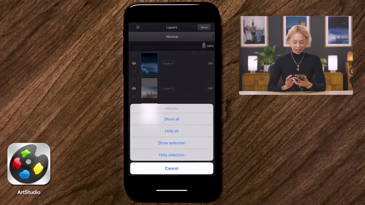 Gradient mask applied to cloud layer over city photograph
With your cloud layer selected, add a layer mask. Inside the mask, switch to the Gradient tool and make sure it’s set to color-one to color-two, meaning it will fade from fully opaque to fully transparent. Drag the gradient so the cloud layer fades naturally into the base image below. The direction matters: you generally want the clouds to appear solid at the top of the frame and dissolve toward the midpoint where the skyline begins. Swopes adjusts this blend several times throughout the process, which is worth noting. Gradient masks aren’t a one-drag operation. You revisit them as the composite develops.
Gradient mask applied to cloud layer over city photograph
With your cloud layer selected, add a layer mask. Inside the mask, switch to the Gradient tool and make sure it’s set to color-one to color-two, meaning it will fade from fully opaque to fully transparent. Drag the gradient so the cloud layer fades naturally into the base image below. The direction matters: you generally want the clouds to appear solid at the top of the frame and dissolve toward the midpoint where the skyline begins. Swopes adjusts this blend several times throughout the process, which is worth noting. Gradient masks aren’t a one-drag operation. You revisit them as the composite develops.
Step 5: Add a Color-Fill Layer to Unify the Tones
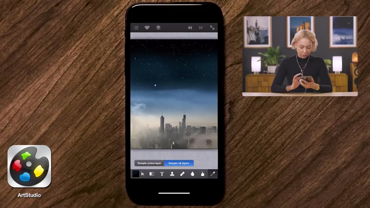 Eyedropper sampling blue from cloud layer for fill
One of the sharper moves in Swopes’ workflow is using a solid color fill layer to correct the tonal mismatch between her base image and the imported sky. She uses the eyedropper tool to sample a blue directly from the cloud layer, creates a new empty layer, and fills it with that sampled color. Then she takes that layer into the blending modes and tests Multiply and Screen to see which one pulls the colors together. Screen lightens the underlying layers and works well when you’re trying to unify a lighter sky tone with a slightly darker base. Multiply does the opposite. Toggle between them and trust your eye over any rule. The goal is a sky that feels like one continuous environment, not two photographs stacked on top of each other.
Eyedropper sampling blue from cloud layer for fill
One of the sharper moves in Swopes’ workflow is using a solid color fill layer to correct the tonal mismatch between her base image and the imported sky. She uses the eyedropper tool to sample a blue directly from the cloud layer, creates a new empty layer, and fills it with that sampled color. Then she takes that layer into the blending modes and tests Multiply and Screen to see which one pulls the colors together. Screen lightens the underlying layers and works well when you’re trying to unify a lighter sky tone with a slightly darker base. Multiply does the opposite. Toggle between them and trust your eye over any rule. The goal is a sky that feels like one continuous environment, not two photographs stacked on top of each other.
Step 6: Duplicate the Cloud Layer for Depth
 Duplicate cloud layer creating foreground and background cloud effect
To create the illusion that the clouds exist in front of and behind the city simultaneously, Swopes duplicates the cloud layer. The original sits behind the cityscape. The duplicate comes in front, masked so only the lower portion of the clouds bleeds across the buildings. This technique is effective because depth in a composite is rarely achieved with a single element. You need the same element at multiple distances. Once the duplicate is in place, she goes back to both masks and fine-tunes the gradients so everything reads as a single, coherent scene rather than layered cutouts.
Duplicate cloud layer creating foreground and background cloud effect
To create the illusion that the clouds exist in front of and behind the city simultaneously, Swopes duplicates the cloud layer. The original sits behind the cityscape. The duplicate comes in front, masked so only the lower portion of the clouds bleeds across the buildings. This technique is effective because depth in a composite is rarely achieved with a single element. You need the same element at multiple distances. Once the duplicate is in place, she goes back to both masks and fine-tunes the gradients so everything reads as a single, coherent scene rather than layered cutouts.
Step 7: Remove Distractions with the Heal Tool
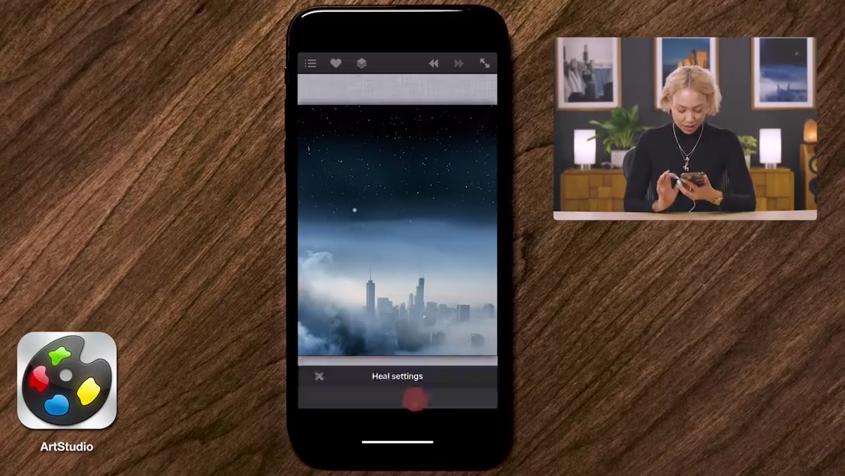 Heal tool zoomed in on unwanted star in the image
Even a well-chosen stock image will have elements you don’t want in the final frame. In this case, a single stray star appears in a spot that breaks the composition. Swopes uses the Heal tool to remove it. The process is close to Photoshop’s Healing Brush: zoom into the problem area, set a source point on clean surrounding texture by holding down on it, then paint over the distraction. The app samples from the source point and blends it into the target. Make sure you’re working directly on the pixel layer and not accidentally on a mask. That’s an easy error to make and the results are confusing until you catch it.
Heal tool zoomed in on unwanted star in the image
Even a well-chosen stock image will have elements you don’t want in the final frame. In this case, a single stray star appears in a spot that breaks the composition. Swopes uses the Heal tool to remove it. The process is close to Photoshop’s Healing Brush: zoom into the problem area, set a source point on clean surrounding texture by holding down on it, then paint over the distraction. The app samples from the source point and blends it into the target. Make sure you’re working directly on the pixel layer and not accidentally on a mask. That’s an easy error to make and the results are confusing until you catch it.
One Thing I’d Add From My Own Practice
Swopes’ workflow is clean and efficient, but there’s one step I’d insert between the color-fill and the duplication: a quick light-direction check. Before you commit to your blend, identify where the light source is in your base image and confirm that your sky elements are lit from the same direction. I’m still bothered by a shadow I placed incorrectly in an early composite that went to print without anyone noticing. The image looked fine. The physics were wrong. Getting in the habit of checking light direction before you finalize any composite saves you from carrying that kind of thing around.
The most important idea in this tutorial isn’t specific to mobile editing. It’s that compositing is compositing. The tools change. The thinking doesn’t. Layering, masking, blending modes, and tonal unification are the same whether you’re in Photoshop on a desktop or Art Studio Pro on your phone. Swopes builds a convincing surreal scene with the same logic I use on commercial projects, just in a smaller environment. That’s the part worth taking seriously.
Watch the full tutorial on YouTube to see Swopes complete the composite with the moon layer and finish the final image.
Comments
Leave a Comment