
There’s a specific kind of problem that every composite artist runs into eventually: you have a vision for a scene that no single photograph can contain. The subject is in one location, the background is in another, the sky is borrowed from a completely different day, and somehow you have to make all of it feel like one coherent moment. I’ve spent years sketching out these problems on paper before I ever open Photoshop, and most of what I sketch comes down to the same challenge Brooke Shaden faces in her work constantly. How do you build something that feels genuinely impossible but never looks fake?
In this CreativeLive tutorial, Shaden walks through the making of one of her signature surrealist composites: a girl suspended in the air, clinging to a rope attached to a boat, shot across multiple locations and lighting conditions. Watch the full tutorial on YouTube. What makes this tutorial unusually valuable is that she doesn’t just show you the finished image. She shows you the bad versions first, explaining exactly what wasn’t working and why she kept pushing. That kind of transparency is rare, and honestly it’s the part that taught me the most.
The technique she covers here is one I’ve returned to on commercial projects more times than I can count. If you’re compositing at any level, from editorial portraiture to full fantasy scenes, what follows is a working breakdown of her process.
Step 1: Direct Your Shoot with the Composite in Mind
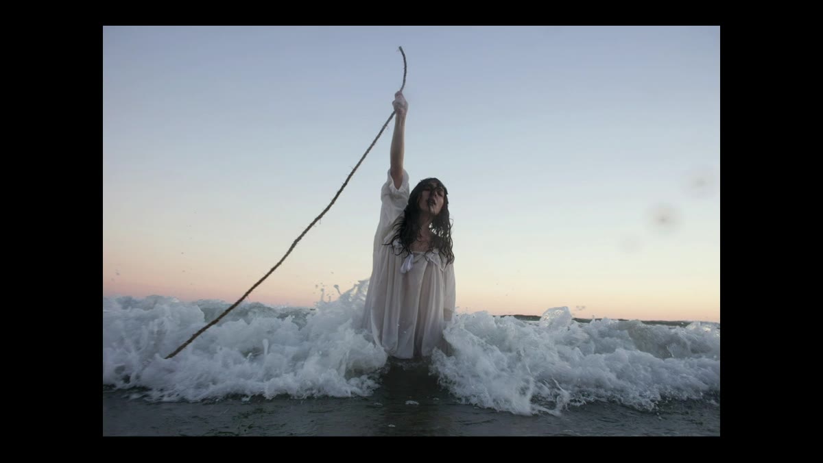 Subject with arm raised straight, showing deliberate posed tension
Before a single image lands in Photoshop, Shaden is already problem-solving. When photographing her subject in the water, she gave very specific direction: one arm straight up, body dangling from it, fully committing to the physical illusion. This wasn’t about aesthetics. It was about physics. If the supporting arm bends even slightly, the body weight reads as fake. Viewers may not be able to name why it looks wrong, but they feel it.
Subject with arm raised straight, showing deliberate posed tension
Before a single image lands in Photoshop, Shaden is already problem-solving. When photographing her subject in the water, she gave very specific direction: one arm straight up, body dangling from it, fully committing to the physical illusion. This wasn’t about aesthetics. It was about physics. If the supporting arm bends even slightly, the body weight reads as fake. Viewers may not be able to name why it looks wrong, but they feel it.
The lesson here transfers directly to your own shoots. Decide in advance what the composite logic of your image is and then direct your subject to honor that logic completely. Ask yourself: what is this person holding, pulling, or being pulled by, and how would gravity actually behave? Then shoot to that answer.
Step 2: Expand the Frame Instead of Pulling Back
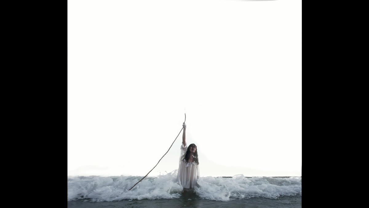 Multiple surrounding shots being assembled to extend the canvas
Shaden describes a technique she calls “expanding the frame,” which she’s been using since around 2009. Rather than stepping back with your camera to capture more of the scene (which reduces your ability to blur the background), you stay close to your subject and take additional photographs of the surrounding area. Those surrounding shots get stitched into the canvas in post, giving you the scale of a wider shot while keeping the depth-of-field properties of a closer one.
Multiple surrounding shots being assembled to extend the canvas
Shaden describes a technique she calls “expanding the frame,” which she’s been using since around 2009. Rather than stepping back with your camera to capture more of the scene (which reduces your ability to blur the background), you stay close to your subject and take additional photographs of the surrounding area. Those surrounding shots get stitched into the canvas in post, giving you the scale of a wider shot while keeping the depth-of-field properties of a closer one.
There are two practical payoffs here. First, you can print the final composite much larger because you’re adding actual pixel data rather than cropping into existing data. Second, and more importantly for storytelling, you maintain control over background blur. If you want a subject sharp against a soft, atmospheric background, staying close gives you that. Stitching fills in the world around them without sacrificing it.
Step 3: Shoot Composite Elements Separately with Smart Background Planning
 Boat photographed on a patio against white towels as background
The boat in Shaden’s image was never near the water. She photographed it on her patio using white towels as a makeshift background. This works because she shoots consistently at twilight: either before the sun rises or just after it sets. At that time of day, the sky reads as white in camera because there isn’t enough light to give it color or detail. A white-towel background and a blown-out twilight sky are nearly identical to the eye and to Photoshop’s selection tools.
Boat photographed on a patio against white towels as background
The boat in Shaden’s image was never near the water. She photographed it on her patio using white towels as a makeshift background. This works because she shoots consistently at twilight: either before the sun rises or just after it sets. At that time of day, the sky reads as white in camera because there isn’t enough light to give it color or detail. A white-towel background and a blown-out twilight sky are nearly identical to the eye and to Photoshop’s selection tools.
The takeaway is to match your extraction background to the environment your subject will eventually live in. If your final sky is going to be white or overcast, shoot against white. If your element is going to sit against a dark, moody background, consider darker separation. The more consistent you make those tones upfront, the less work you do fighting edge halos in post. Plan the removal before you press the shutter.
Step 4: Replace the Sky to Control Visual Weight
 Stormy sky layer added, replacing the blown-out white original
Once the base composite was assembled, Shaden flagged a problem with the original sky. A large expanse of white draws the eye. The human visual system moves toward the brightest point in the frame, which means a white sky will pull attention away from your subject every time. It doesn’t matter how well-composited the rest of the image is if the background is louder than the foreground.
Stormy sky layer added, replacing the blown-out white original
Once the base composite was assembled, Shaden flagged a problem with the original sky. A large expanse of white draws the eye. The human visual system moves toward the brightest point in the frame, which means a white sky will pull attention away from your subject every time. It doesn’t matter how well-composited the rest of the image is if the background is louder than the foreground.
Her solution was to bring in a stormy, textured sky that served the emotional tone of the image. This darkens the upper portion of the frame, redirects the eye toward the subject, and adds narrative context. The scene now reads as ominous rather than overexposed. When you’re selecting a replacement sky, don’t just ask whether it looks good in isolation. Ask what it does to the visual hierarchy of the entire composition.
Step 5: Build the Image in Layers, Working Outward from the Subject
 Underwater portion being added to the lower frame of the composite
Shaden works outward. She establishes the central subject first, then adds environmental elements in rings around it: above, below, and to the sides. By the time she’s adding the underwater portion to the bottom of the frame, she has a clear center of gravity to work against. Every new element is measured against what’s already locked in.
Underwater portion being added to the lower frame of the composite
Shaden works outward. She establishes the central subject first, then adds environmental elements in rings around it: above, below, and to the sides. By the time she’s adding the underwater portion to the bottom of the frame, she has a clear center of gravity to work against. Every new element is measured against what’s already locked in.
This approach prevents one of the most common compositing problems I see, which is building around an unstable center. If your subject isn’t finalized, every element you add around them becomes a renegotiation. Establish your anchor layer completely, including color-grading adjustments, before you start extending the world.
Step 6: Use Color Grading to Unify What the Camera Couldn’t
 Color adjustments being applied across the layered composite
Because Shaden’s image was shot across multiple locations, different times, and different lighting conditions, the color relationships between elements need to be built in post rather than captured in camera. She treats color grading not as a finishing step but as a structural one. The unified color palette is what makes a viewer believe the impossible geography of the scene.
Color adjustments being applied across the layered composite
Because Shaden’s image was shot across multiple locations, different times, and different lighting conditions, the color relationships between elements need to be built in post rather than captured in camera. She treats color grading not as a finishing step but as a structural one. The unified color palette is what makes a viewer believe the impossible geography of the scene.
Start by identifying the dominant color temperature you want the final image to carry, then push every element toward it. Shadows, highlights, and midtones should all have a shared bias. If your subject is lit warm and your background is cool, your eye will always see them as separate photographs.
What I’d Add from My Own Work
I’ve spent time studying light behavior on water for composite projects, and one thing Shaden’s workflow confirms for me is how much the pre-production thinking matters. The technical execution in Photoshop is genuinely secondary to the decisions you make before you press a shutter. The bad composites in my “failures” folder almost always trace back to a shoot where I didn’t think through the physics or the light direction first. The fix is rarely available in post. The frame expansion technique in particular has changed how I plan larger print composites. It costs maybe twenty extra minutes on location. It saves hours of trying to fake detail that was never captured.
The single most important idea in this entire tutorial is that believability is a design decision, not an accident. Shaden earns the surreal quality of her images by respecting the physical logic underneath them. That’s the discipline that separates a composite that makes someone stop scrolling from one that just looks edited.
Watch the full tutorial on YouTube to see the image build in real time and hear Shaden’s commentary on the choices she made at each stage.
Comments
Leave a Comment