Every time I take on a project that involves liquid, I feel it. That low-grade anxiety that comes from knowing the camera has to be smarter than physics, and that I have to be smarter than the camera. Last spring I was building a composite for a book cover that involved tea being poured mid-air into a tilted cup. The client wanted it to feel weightless, almost dreamlike. I had sourced stock splashes, tried three different water textures from my reference library, and none of it held up under scrutiny. The surface behavior was wrong. The light was hitting the liquid like it was made of plastic. I knew the problem: I had never actually studied how to photograph the thing I was trying to fake.
That sent me straight to this tutorial.
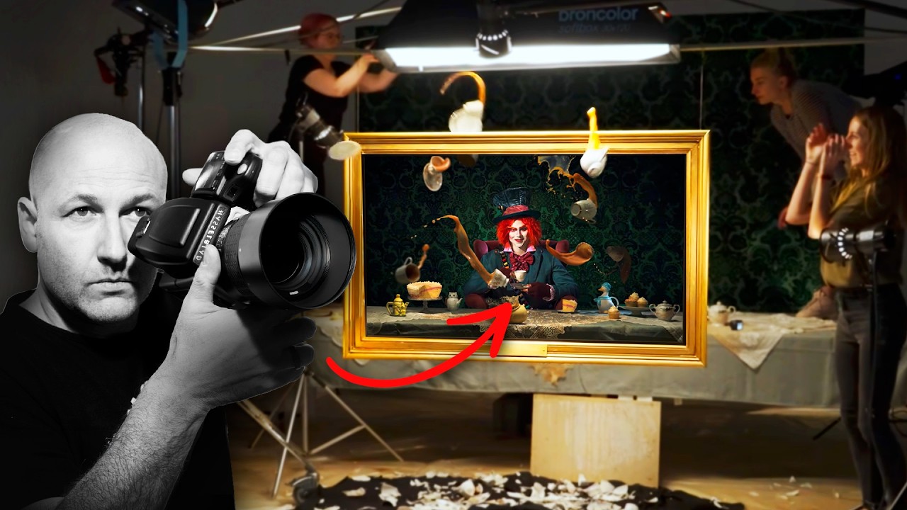
In this Visual Education breakdown, creator and educator behind the channel walks through an entire conceptual set build inspired by the Mad Hatter’s tea party, using it as a vehicle to teach the real physics of high-speed liquid photography. The subject is theatrical, but the technique is transferable to anything from a kitchen glass to a full studio pour.
Why the Set Build Is the Real First Lesson
Before a single frame is shot, the tutorial spends real time on the physical construction of the set and props. Crockery is deliberately distressed. Surfaces are aged. The environment is built to tell the story before the camera turns on.
For compositors, this is the part we usually skip because we assume we can fix it in post. We cannot, not really. The more chaotic and textured an element is in the original capture, the more convincingly it sits in a scene. A pristine, studio-clean teacup photographed against white will never feel like it belongs in a moody, dark composite no matter how many blend modes you throw at it. The distressing has to happen before the shot.
The tutorial makes this point by showing exactly how props were treated: scuffed edges, added grime, selective painting to push age. These are the same principles I use when I’m doing digital painting on top of composites, but seeing them applied practically reminded me that the best compositors I know own some kind of physical toolkit. Sandpaper. Tea staining. It sounds analog in the best possible way.
Drop Heights and the Science of Predictable Smashing
One of the most specific and useful sections of the tutorial covers testing drop heights for crockery. The goal is to find the height at which a piece breaks in a visually interesting way while staying close enough to the frame to be usable. Too low and it cracks without drama. Too high and the pieces scatter beyond what you can work with.
The process described is methodical: start low, document results, increase incrementally, and repeat. You are not guessing. You are building a data set. This is the kind of thinking that separates photographers who get the shot from photographers who hope to get the shot.
For high-speed splash timing, the tutorial is equally precise. The key variable is the interval between the drop trigger and the flash firing. Even small adjustments in milliseconds change the shape of the splash entirely. The recommended approach is to bracket your timing the same way you would bracket exposure, making small, consistent changes and shooting multiples at each interval. You end up with a library of splash shapes from a single session, which is exactly the kind of asset collection that makes composite work faster and more convincing.
Shaping Light for Mood Without Losing Detail in the Liquid
The lighting setup in the tutorial is built around a dark, mysterious atmosphere, with light shaped tightly to avoid flooding the set and killing the shadows. The liquid is the brightest element in the frame by design. Everything else exists in relative darkness.
The practical instruction here is about using flags and negative fill to actively remove light from areas of the scene rather than just adding it. This is counterintuitive for people who come from a “more light equals better photos” background, but it is fundamental to moody work. You are sculpting with absence.
For liquid specifically, the position of the key light relative to the splash determines whether the water reads as transparent, translucent, or opaque. A light placed behind or beside the liquid and aimed through it creates that luminous, glowing quality that makes splashes look like they belong in a painting. A light placed flat in front turns it into a grey blob. The tutorial demonstrates this clearly, and it reframed something I had been doing wrong in my own reference photography for longer than I want to admit.
Where I Would Push This Further
I spent about six months studying water behavior for an album cover project a few years ago, so high-speed liquid is a subject I have strong opinions about. The one place I would extend this tutorial’s approach is in capturing multiple splash stages and blending them in post. The tutorial focuses on nailing a single frame, which is the right foundation. But for composite work, having four or five frames from the same pour at different stages of development gives you enormous control over the final shape of the water in the scene. You are no longer locked to one moment. You can build the splash you need from the real physics of the actual pour.
It adds a layer of complexity to the shoot, but for anyone doing this work commercially, that flexibility is worth the extra cards full of test frames.
The Single Thing That Changes How You Shoot for Composites
The tutorial’s core argument is this: understand the physics of your subject before you try to capture it, and certainly before you try to fake it. Timing, light position, drop height, all of it follows from understanding what the material actually does.
Watch the full Visual Education tutorial for the visual demonstration. The written breakdown will get you thinking. The video will show you exactly what controlled chaos looks like when it works.
Comments
Leave a Comment