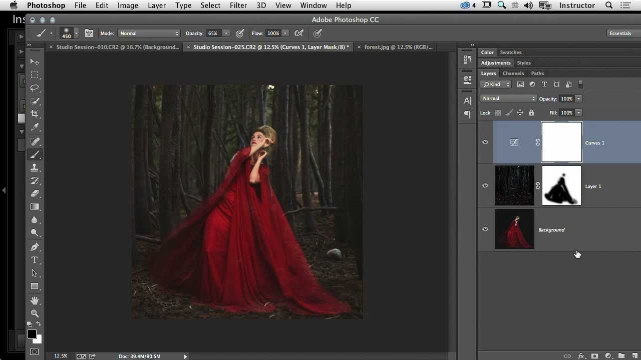
There is a specific kind of problem that haunts compositors who work in narrative imagery: you have a beautiful subject, a beautiful environment, and no amount of cutting and pasting makes them feel like they belong together. The tones fight. The colors argue. The whole thing looks like a ransom note made from magazine clippings. I have been building composites professionally for over a decade, and that problem still shows up on my desk regularly. What separates working artists from people who struggle with it is not talent. It is a reliable workflow for making disparate images feel like they were born in the same light.
In this CreativeLive tutorial, Brooke Shaden walks through the construction of a fairy tale composite image, and what she demonstrates is not just a series of Photoshop steps. It is a philosophy: blend first, fix second, match tones always. If you work in fine art, book covers, or any narrative compositing context, the approach she models here is worth studying carefully. Watch the full tutorial on YouTube and follow along with the breakdown below.
Step 1: Clean the Base Image With the Clone Stamp
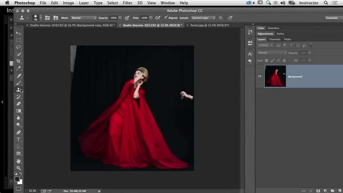 Clone Stamp tool being sized up with reduced hardness
Before any compositing begins, the base image needs to be clean. Shaden opens with the Clone Stamp tool, scales it up to a generous size, and drops the hardness down so the edges of the cloned areas blend rather than stamp. She is removing elements from the frame that do not serve the final image. The specific thing she removes is not the point. The habit is: do not carry problems into a composite. Every distraction you leave in the base image is a problem you will be trying to work around for the rest of the session.
Clone Stamp tool being sized up with reduced hardness
Before any compositing begins, the base image needs to be clean. Shaden opens with the Clone Stamp tool, scales it up to a generous size, and drops the hardness down so the edges of the cloned areas blend rather than stamp. She is removing elements from the frame that do not serve the final image. The specific thing she removes is not the point. The habit is: do not carry problems into a composite. Every distraction you leave in the base image is a problem you will be trying to work around for the rest of the session.
Keep your clone stamp soft, work in short strokes rather than long drags, and zoom in close enough to see what you are actually doing. Sloppy cleanup at this stage compounds into visible seams later.
Step 2: Drop in the Background Layer
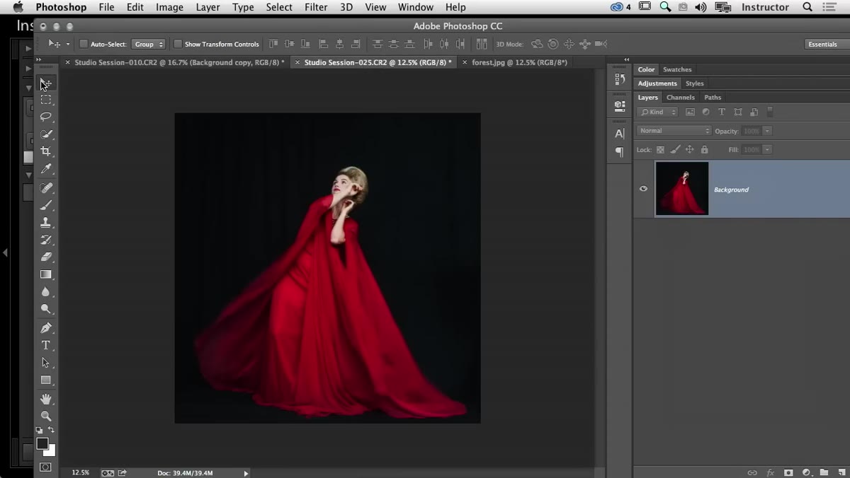 Forest image being dragged and dropped onto the working document
With the base cleaned, Shaden brings in a forest photograph by dragging it directly from its tab onto the working document. This is a fast, non-destructive way to add a layer without going through File, Place. The forest image happens to land at a workable size, which she notes with some satisfaction. If yours does not, use Free Transform to scale it before doing anything else.
Forest image being dragged and dropped onto the working document
With the base cleaned, Shaden brings in a forest photograph by dragging it directly from its tab onto the working document. This is a fast, non-destructive way to add a layer without going through File, Place. The forest image happens to land at a workable size, which she notes with some satisfaction. If yours does not, use Free Transform to scale it before doing anything else.
At this point she is not worried about precise placement. She is establishing the foundation of the composite’s environment and will refine everything through blending and masking in the steps ahead.
Step 3: Explore Blend Modes Instead of Opacity
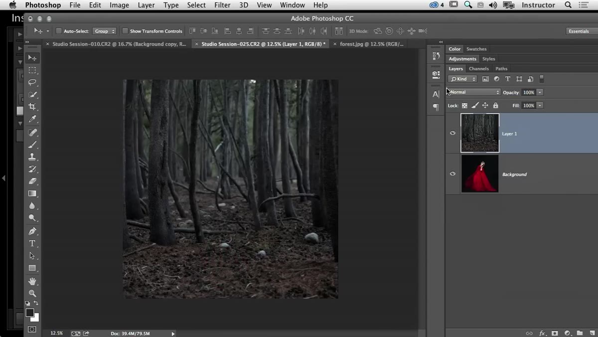 Layer blend mode dropdown open showing Lighten and Screen options
This is the step most tutorials rush past, and it is the one that changes everything. Rather than simply lowering the layer’s opacity to fade the forest into the background, Shaden works through the blend mode dropdown in the Layers panel. She cycles through the options methodically. Multiply and the burn modes are too dark for what she wants. Lighten and Screen both work, because they allow the subject underneath to remain visible while the forest environment wraps around her.
Layer blend mode dropdown open showing Lighten and Screen options
This is the step most tutorials rush past, and it is the one that changes everything. Rather than simply lowering the layer’s opacity to fade the forest into the background, Shaden works through the blend mode dropdown in the Layers panel. She cycles through the options methodically. Multiply and the burn modes are too dark for what she wants. Lighten and Screen both work, because they allow the subject underneath to remain visible while the forest environment wraps around her.
My own preference in similar composites leans toward Screen for atmospheric backgrounds because it naturally lifts shadow detail in the overlay layer, but the right answer depends on your specific images. Spend two minutes cycling through every mode before committing. What looks wrong at full opacity will often reveal something interesting once you adjust the curves in the next step.
Step 4: Adjust Curves on the Forest Layer
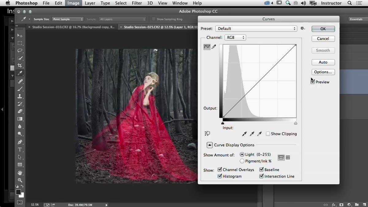 Curves adjustment darkening the forest layer
Once a blend mode is chosen, Shaden pulls the forest layer down in tone using a Curves adjustment applied directly to that layer. She wants the forest to read as atmosphere and suggestion, not as a competing subject. Pulling the curve down in the midtones and shadows pushes the environment back visually without destroying the texture and detail that make the composite feel real.
Curves adjustment darkening the forest layer
Once a blend mode is chosen, Shaden pulls the forest layer down in tone using a Curves adjustment applied directly to that layer. She wants the forest to read as atmosphere and suggestion, not as a competing subject. Pulling the curve down in the midtones and shadows pushes the environment back visually without destroying the texture and detail that make the composite feel real.
This is a principle I return to constantly in my own work: background elements should support the subject, not compete with them. A slightly underexposed environment makes the subject feel like the light source is on them specifically. That directionality is what gives a composite its sense of physical truth.
Step 5: Mask the Forest Off the Subject With a Layer Mask
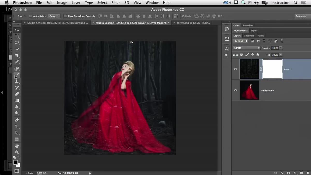 Layer mask being painted with black brush to reveal subject
Rather than using the Eraser tool, which destroys pixels permanently, Shaden adds a Layer Mask to the forest layer and paints on it with a large, soft black brush. Painting black on a mask hides the layer. Painting white reveals it. She sets the brush size to around 400 to 450 pixels and moves quickly over the subject’s dress and body to let the original figure show through cleanly.
Layer mask being painted with black brush to reveal subject
Rather than using the Eraser tool, which destroys pixels permanently, Shaden adds a Layer Mask to the forest layer and paints on it with a large, soft black brush. Painting black on a mask hides the layer. Painting white reveals it. She sets the brush size to around 400 to 450 pixels and moves quickly over the subject’s dress and body to let the original figure show through cleanly.
The critical detail she adds: she switches to white at reduced opacity to bring back subtle traces of the forest over the edges of the figure. Small amounts of the environment bleeding across the subject’s outline is what sells the placement. Hard, perfectly cut edges are what make composites look like paper dolls. The mask controls all of this, and you can always paint back whatever you erase by switching brush color from black to white.
Step 6: Match the Black Points Across All Layers
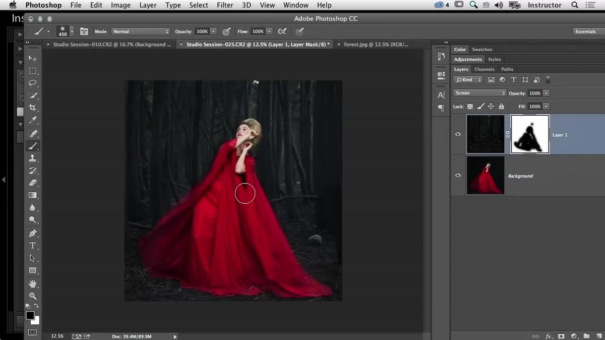 Curves on subject layer pulling blacks down to match background
Here is where compositing discipline separates a finished image from a pasted one. Shaden notices that the deep blacks in the subject’s dress do not match the darkest values in the forest background. She goes into the Curves for the subject layer and brings the blacks down to match. This single adjustment, matching black points across layers, is one of the non-negotiable steps in any composite I build. If the darkest shadow in one layer is a warm near-black and the darkest shadow in another layer is a cool dark gray, the eye reads them as coming from different places. Because they are.
Curves on subject layer pulling blacks down to match background
Here is where compositing discipline separates a finished image from a pasted one. Shaden notices that the deep blacks in the subject’s dress do not match the darkest values in the forest background. She goes into the Curves for the subject layer and brings the blacks down to match. This single adjustment, matching black points across layers, is one of the non-negotiable steps in any composite I build. If the darkest shadow in one layer is a warm near-black and the darkest shadow in another layer is a cool dark gray, the eye reads them as coming from different places. Because they are.
Step 7: Unify the Color With Hue/Saturation and Replace Color
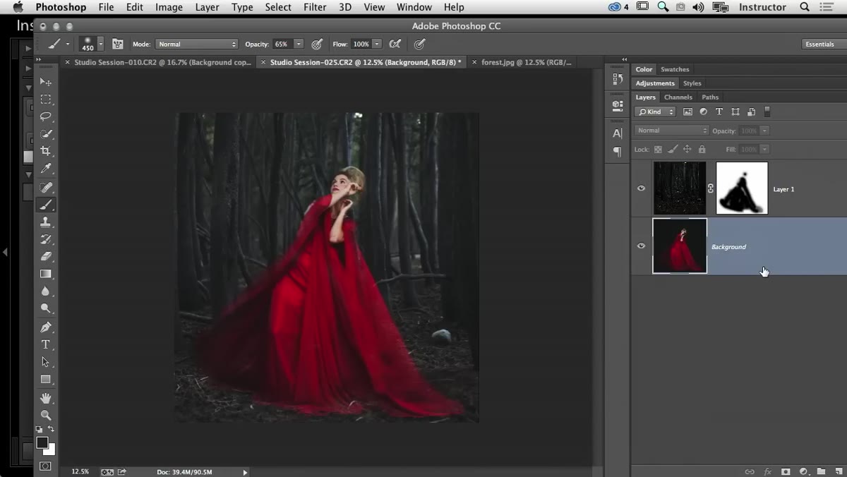 Hue/Saturation panel with saturation slider being pulled down
With the tones matched, Shaden turns to color. The subject’s dress is saturated red against a desaturated, cool forest. Using Command plus U to open Hue/Saturation, she pulls the saturation down on the subject layer to bring the two images closer together. Then she goes a step further with Image, Adjustments, Replace Color, using the eyedropper to select the remaining red in the dress and targeting that specific hue for further adjustment.
Hue/Saturation panel with saturation slider being pulled down
With the tones matched, Shaden turns to color. The subject’s dress is saturated red against a desaturated, cool forest. Using Command plus U to open Hue/Saturation, she pulls the saturation down on the subject layer to bring the two images closer together. Then she goes a step further with Image, Adjustments, Replace Color, using the eyedropper to select the remaining red in the dress and targeting that specific hue for further adjustment.
Replace Color is underused in composite work. It lets you isolate a specific color range and shift its hue, saturation, and lightness without affecting anything outside that selection. For narrative compositing where you need a subject’s clothing or skin to match the color temperature of an entirely different background image, it is precise and fast.
What I Would Add From My Own Workflow
Shaden builds this composite intuitively and rapidly, which is the mark of someone who has internalized these steps. What I would add for anyone working toward similar results in a professional context: do your tone matching before you do your color matching. Every time. Curves first, Hue/Saturation second. Trying to match colors between layers that have different tonal structures is like trying to paint a wall when the plaster is still wet. The tones give the color something stable to live on.
I also keep a reference composite open in a second window whenever I am building fairy tale or surreal work. Something by Shaden herself, or Erik Almas, or Brooke’s contemporaries in fine art photography. Not to copy, but to keep my eye calibrated. It is easy to drift when you are deep inside a single image. An external reference pulls you back.
The single most important thing Shaden demonstrates in this tutorial is not any individual tool. It is the habit of asking, at every step, whether this element looks like it belongs to the same world as every other element. Compositing is an argument for believability, and every decision either strengthens or weakens that argument.
Watch the full tutorial on YouTube to see Shaden move through these steps in real time. Her instincts at each decision point are as instructive as the techniques themselves.
Comments (2)
Simple but effective. Sometimes that's all you need.
Love how you break down complex stuff into manageable steps.
Leave a Comment