Product compositing is a commercial art form with zero tolerance for visible mistakes. When an ad shows a perfume bottle on a marble surface with dramatic lighting, that bottle was almost certainly photographed separately and composited in. The margin for error is thin — consumers may not consciously notice bad compositing, but they’ll feel that something is wrong.
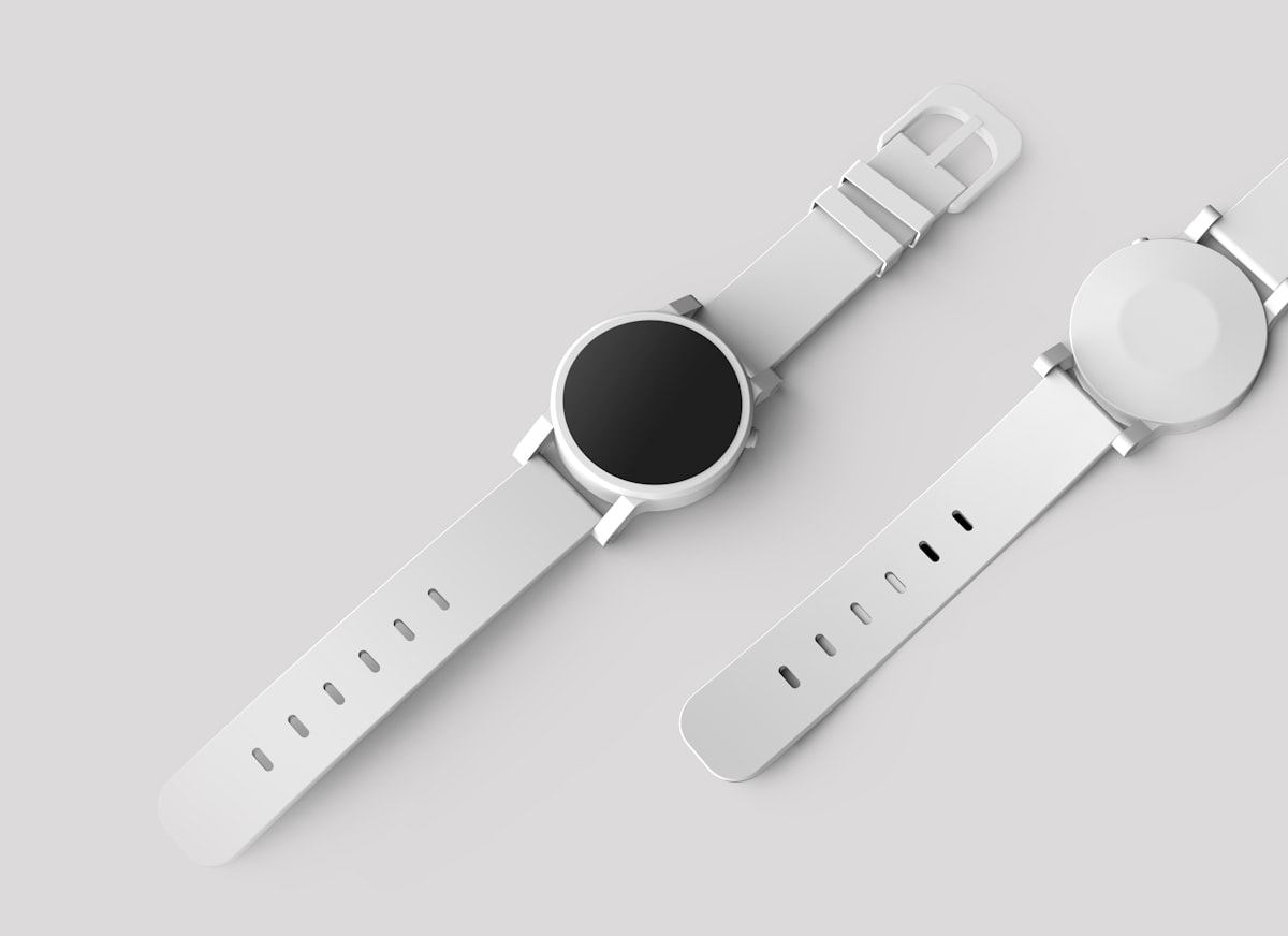
Photographing Products for Compositing
Shoot the product on a clean background — white, gray, or black depending on the product. Use multiple lighting setups and photograph each one separately:
The hero shot. Your primary product lighting with clean shadows and highlights that define the product’s shape. This is your base layer.
Highlight passes. Photograph the product with a light specifically positioned to create desirable highlights — the gleam on a watch face, the shine on a glass bottle, the edge light on a matte box.
Shadow passes. Photograph with lighting that creates specific shadow effects you want to control independently.
Detail passes. Close-up lighting that reveals texture, embossing, or fine details that get lost in the hero lighting.
Compositing these passes together gives you complete control over the final lighting — much more than trying to achieve everything in a single shot.
Extracting the Product
Product extraction demands perfection. The Pen Tool is your primary extraction method because products typically have clean, defined edges. Trace every edge with precision, including small details like clasps, buttons, and labels.
For transparent or translucent products (glass bottles, clear packaging), standard masking fails. Instead:
- Photograph the product on both white and black backgrounds
- Use the black background shot on Screen blend mode to capture the highlights and transparency
- Use the white background shot for the product’s body and opaque areas
- Combine using masks to blend the two
Building the Scene
Surface Interaction
When a product sits on a surface, several things happen simultaneously:
Contact shadow. A dark shadow directly beneath the product where it meets the surface. This is dense and sharp-edged.
Cast shadow. A softer shadow extending away from the product in the direction opposite the light source. The farther from the product, the softer and lighter the shadow becomes.
Reflection. Glossy surfaces reflect the product. Even matte surfaces have a subtle reflection at very shallow angles. Create the reflection by flipping a copy of the product vertically, reducing opacity, and masking with a gradient.
Color bounce. A colored product bounces its color onto adjacent surfaces. A red bottle on a white surface tints the nearby surface slightly pink. Paint this subtle color bounce on a separate layer using Color or Soft Light blend mode.
Lighting the Scene
The scene’s lighting must match the product’s lighting exactly. If your product has a key light from the upper right, the scene must be lit from the upper right. Mismatched lighting is the single most common failure in product compositing.
Add scene lighting effects after placing the product:
- Specular highlights on surfaces where the light source would create them
- Shadow casting from any other elements in the scene
- Light fall-off — surfaces closer to the light source are brighter than distant ones
Material-Specific Techniques
Glass and Liquid
Glass requires transparency, refraction, and caustic highlights. Composite glass products using Screen blend mode for the transparent areas. Add caustic light patterns (those bright patches of light that shine through glass) on the surface behind the product.
Metal
Metal is defined by its reflections. Chrome reflects the environment; brushed metal creates directional reflections; matte metal has broad, soft highlights. Environment reflections on metal products should show a stylized version of the scene — paint these manually for control.
Fabric and Soft Goods
Fabric products need convincing wrinkles and folds. If your product shot was taken flat but the scene requires a draped appearance, use the Warp tool to add realistic deformation. Copy wrinkle shadows from reference fabric photographs to add depth.
Color Consistency
Advertising demands color accuracy. The product’s colors in the composite must match the real product exactly. Use a color checker in your product shoot, and calibrate your monitor. After compositing, compare against the physical product under neutral lighting.
Client revisions often include “make the blue slightly more vibrant” or “the red looks too orange.” Build your composite with color adjustment layers clipped to the product so these changes take seconds, not hours.
Final Quality Control
View the final composite at print resolution. Zoom to 100% and inspect every edge, every shadow, every highlight. Check: Are the shadows consistent with a single light source? Do reflections match the environment? Is the product’s scale correct relative to other objects in the scene? Does the surface interaction look physically correct?
Then print it. Screen proofs miss issues that become obvious in print, especially in shadow areas and subtle color shifts.