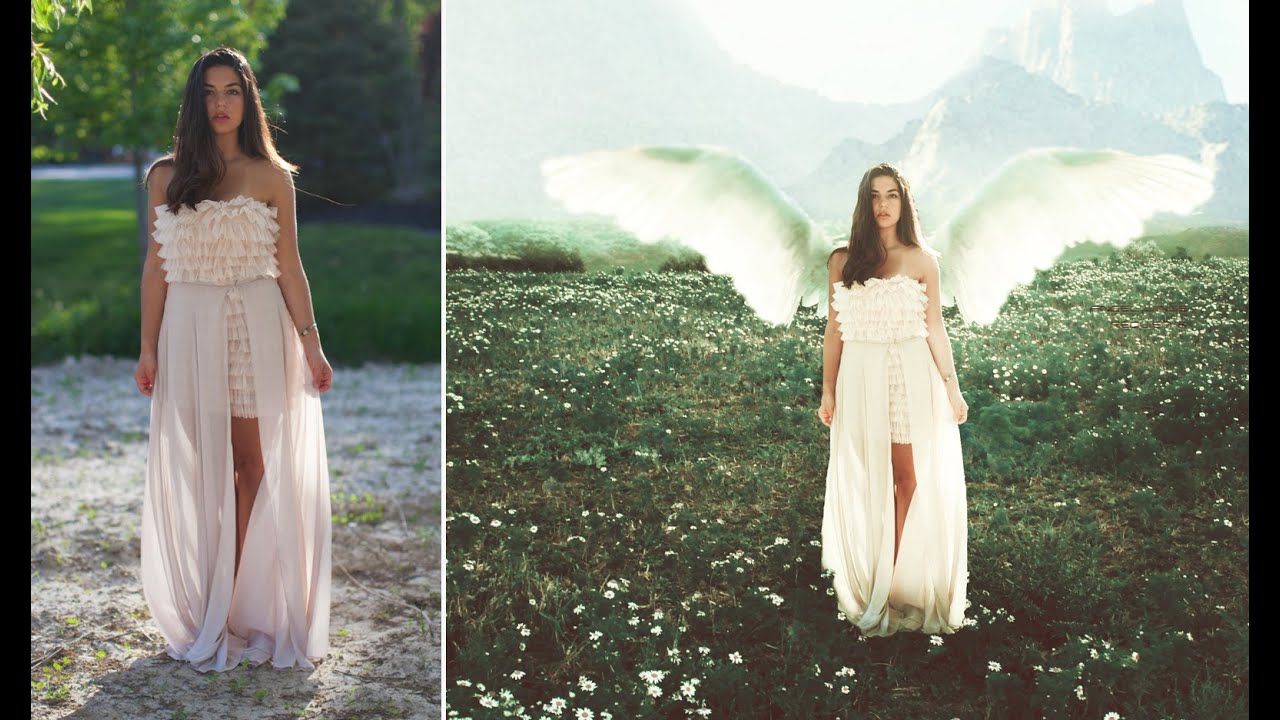
Every composite I’ve built professionally, whether for a book cover or a movie poster, starts with the same fundamental challenge: making a subject feel like they genuinely belong somewhere they have never been. That sounds simple. It isn’t. The model’s light is wrong, the scale is off, the edges look like someone attacked them with scissors. Getting all of those variables to cooperate at once is the actual craft.
That’s why I keep coming back to tutorials that show a complete, start-to-finish workflow rather than isolated tricks. In this Jessica Kobeissi fantasy photo manipulation tutorial, Kobeissi walks through building a surreal landscape composite from a portrait photo, a mountain scene, and some floral elements. The approach is honest and personal, and the workflow moves in the same logical order I use professionally: place the subject, build the world around them, then make the two feel like they share the same air.
What I appreciate about her method is that she doesn’t skip over the unglamorous decisions. She talks through why she chooses Quick Mask over Quick Selection, why a low-hardness brush matters when blending a sky replacement, why you want the subject interacting with environmental elements rather than just floating in front of them. These are the decisions that separate a composite that reads as real from one that just looks like a collage. Let me walk you through the process step by step.
Step 1: Place and Scale Your Subject
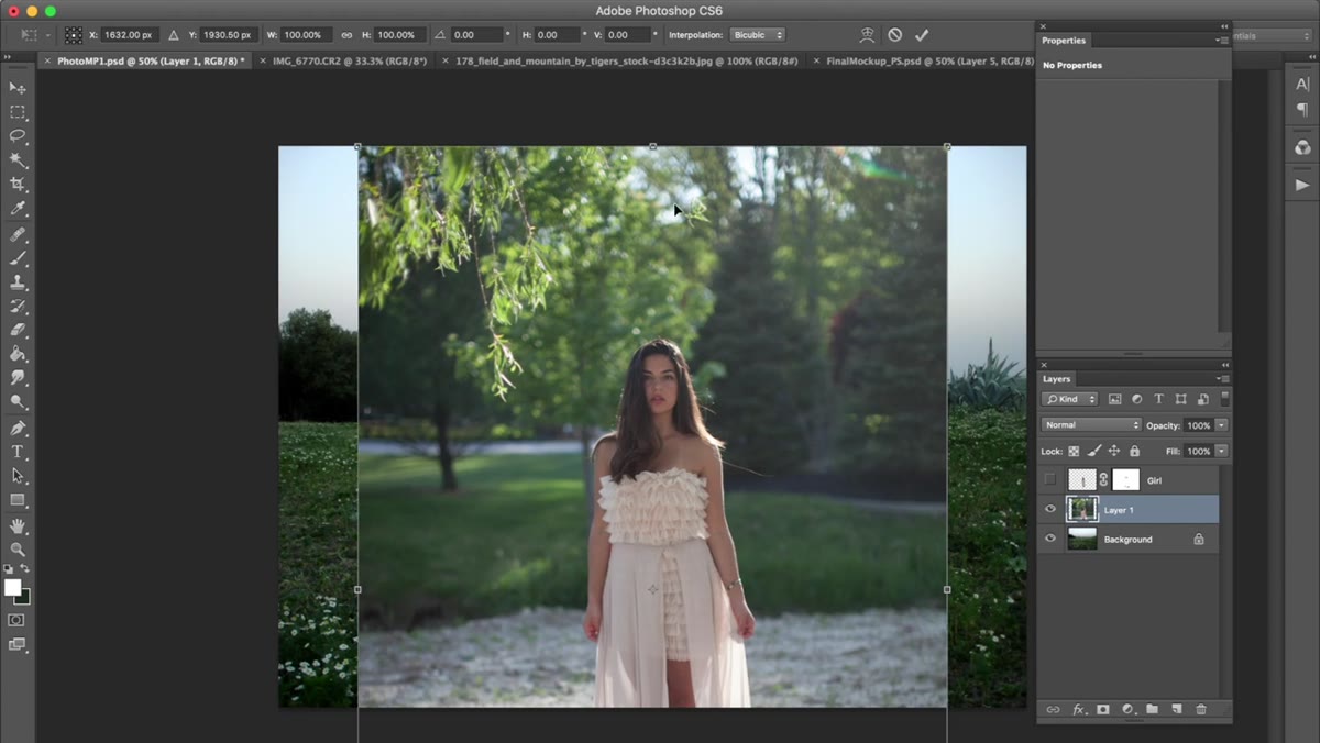 Model photo being pasted onto landscape background
Open your background landscape image first, then copy your subject photo and paste it in as a new layer. Once it lands, use Free Transform (Command + T on Mac, Ctrl + T on Windows) to scale the subject so their proportions feel natural within the scene. Hold Alt and Shift while dragging a corner handle to scale from the center while keeping the proportions locked. Don’t just shrink the figure to fit the frame. Think about where they would actually stand in this environment, and use scale to sell that spatial relationship.
Model photo being pasted onto landscape background
Open your background landscape image first, then copy your subject photo and paste it in as a new layer. Once it lands, use Free Transform (Command + T on Mac, Ctrl + T on Windows) to scale the subject so their proportions feel natural within the scene. Hold Alt and Shift while dragging a corner handle to scale from the center while keeping the proportions locked. Don’t just shrink the figure to fit the frame. Think about where they would actually stand in this environment, and use scale to sell that spatial relationship.
Step 2: Cut Out the Subject Using Quick Mask
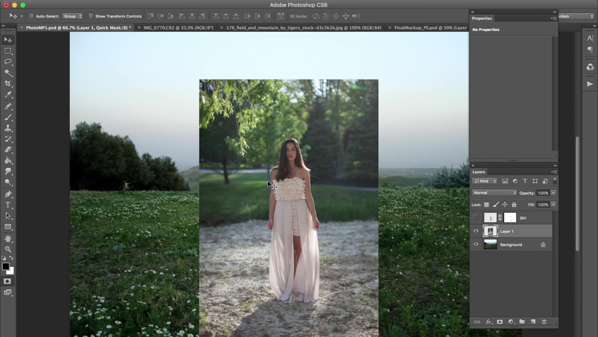 Quick Mask mode active, red overlay covering the model
Press Q to enter Quick Mask mode. Your toolbar will shift, and you’ll paint a red overlay directly on your canvas. Use a round brush with hardness at roughly 85% and opacity at 100%. Paint over your subject completely. The red overlay marks what you’re selecting, so cover every part of the figure you want to keep. If you overpaint and clip into the background, press X to switch to white paint and erase the mistake. When the coverage looks clean, press Q again to exit Quick Mask and convert your painted area into an active selection.
Quick Mask mode active, red overlay covering the model
Press Q to enter Quick Mask mode. Your toolbar will shift, and you’ll paint a red overlay directly on your canvas. Use a round brush with hardness at roughly 85% and opacity at 100%. Paint over your subject completely. The red overlay marks what you’re selecting, so cover every part of the figure you want to keep. If you overpaint and clip into the background, press X to switch to white paint and erase the mistake. When the coverage looks clean, press Q again to exit Quick Mask and convert your painted area into an active selection.
Kobeissi prefers Quick Mask over Quick Selection because she works with a drawing tablet and gets more control over fine edges with a brush. I’ve used both methods on deadline, and for subjects with complex edges like hair or flowing fabric, Quick Mask with a pressure-sensitive tablet is still faster than any automated selection tool for final cleanup. Once your selection is active, cut the subject out with Command + X and paste them onto your landscape.
Step 3: Bring In a Sky or Background Layer
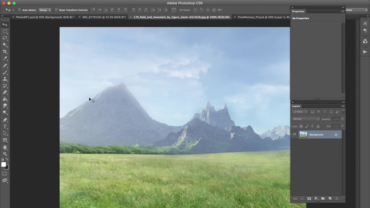 Mountain photo being scaled over the landscape layer
Source a secondary background image, in Kobeissi’s case a mountain range with clean, graphic lines, and paste it into the composition above your base landscape layer but below your subject. Use Free Transform again to scale it so the horizon line sits at a believable height within the frame. You’re not just filling the top half of the image. You’re thinking about where the camera would have been pointed if this location actually existed.
Mountain photo being scaled over the landscape layer
Source a secondary background image, in Kobeissi’s case a mountain range with clean, graphic lines, and paste it into the composition above your base landscape layer but below your subject. Use Free Transform again to scale it so the horizon line sits at a believable height within the frame. You’re not just filling the top half of the image. You’re thinking about where the camera would have been pointed if this location actually existed.
Step 4: Mask the Background Layer to Blend It In
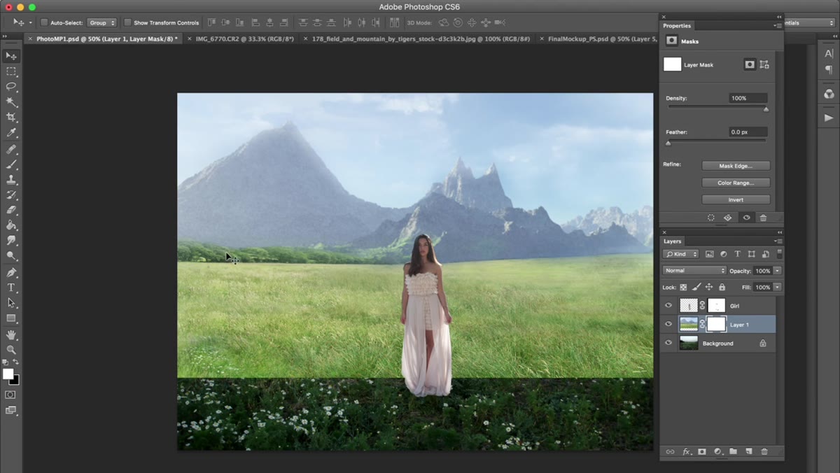 Layer mask being painted to reveal mountains, hide lower portion
With the mountain layer selected, click the Add Layer Mask button at the bottom of the Layers panel. Grab your Brush tool and set hardness to 0%, opacity to 100%, and paint with black. Painting black onto a layer mask hides that part of the layer. Start by painting over the lower portion of the mountain photo to let the base landscape show through underneath. For areas where the two backgrounds meet, drop your brush opacity to somewhere around 30-50% and make several light passes. This lets elements from the original landscape, bushes, ground cover, anything with organic texture, peek through and soften the seam so it doesn’t read as a hard splice.
Layer mask being painted to reveal mountains, hide lower portion
With the mountain layer selected, click the Add Layer Mask button at the bottom of the Layers panel. Grab your Brush tool and set hardness to 0%, opacity to 100%, and paint with black. Painting black onto a layer mask hides that part of the layer. Start by painting over the lower portion of the mountain photo to let the base landscape show through underneath. For areas where the two backgrounds meet, drop your brush opacity to somewhere around 30-50% and make several light passes. This lets elements from the original landscape, bushes, ground cover, anything with organic texture, peek through and soften the seam so it doesn’t read as a hard splice.
This is the step where most beginners make the mistake of going too fast. A rough blend here poisons everything that comes after it. The eye is looking for that horizon line, and if it catches a hard edge, the whole image collapses.
Step 5: Add Environmental Elements to Anchor the Subject
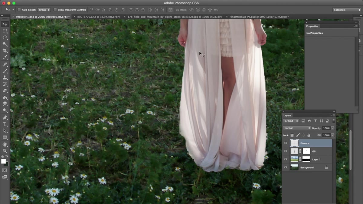 Flowers being composited around the model’s dress area
Kobeissi adds floral elements around the base of her subject’s dress, and this is a move I consider non-negotiable in serious compositing work. A figure that has nothing growing around their feet, no shadow, no ground-level detail, no interaction with the environment at all, reads immediately as pasted in. Adding flowers, grass, or foliage that overlaps the subject’s lower body creates the visual logic that they are standing inside the scene rather than in front of it.
Flowers being composited around the model’s dress area
Kobeissi adds floral elements around the base of her subject’s dress, and this is a move I consider non-negotiable in serious compositing work. A figure that has nothing growing around their feet, no shadow, no ground-level detail, no interaction with the environment at all, reads immediately as pasted in. Adding flowers, grass, or foliage that overlaps the subject’s lower body creates the visual logic that they are standing inside the scene rather than in front of it.
Place your floral or botanical elements on a layer above the background but use masking to tuck parts of the elements behind the subject’s body where the geometry demands it. This layering is what creates depth. Think foreground, midground, subject, and the relationship between all three.
What I’d Do Differently in a Professional Context
The workflow Kobeissi demonstrates is clean and teachable, and it maps directly to how I’d approach a personal project. For commercial work, I’d add a few things. First, I always sketch the composite on paper before I open Photoshop. Even a rough thumbnail forces me to think about light direction before I’m distracted by the actual pixels, and catching a mismatched shadow on paper is a lot cheaper than catching it after two hours of blending. Second, I’d drop a Color Balance or Curves adjustment layer clipped to the subject layer early in the process, just to start nudging the subject’s tones toward the color temperature of the background. You can refine it later, but having it there as a placeholder keeps you honest about how far apart the two images actually are.
The single shadow direction mistake I made on my first published composite still sits in my memory better than any tutorial I’ve watched. No one on the client side caught it. That’s not the point. You catch it. And then you never do it again.
The core lesson from Kobeissi’s tutorial is one I’d tattoo on the wall of every beginner’s workspace: the composite isn’t done when the subject is cut out. It’s done when the environment responds to the subject and the subject responds to the environment. Everything in this workflow, the blended sky, the masked ground, the layered flowers, is in service of that one idea.
Watch the full tutorial on YouTube to see each of these steps demonstrated in real time, including how Kobeissi handles the brush work in Quick Mask and the specific way she paints through her sky blend.
Comments
Leave a Comment