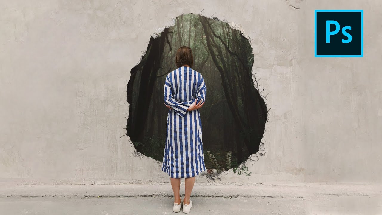
Every composite I’ve ever built starts with the same question: what would be physically impossible to photograph? That’s the whole point. If a camera could capture it, I wouldn’t need Photoshop. My best work, the movie posters and album covers that clients remember, comes from images that feel like they should be real but couldn’t be. A hole punched clean through a concrete wall revealing a forest on the other side is exactly that kind of image. It’s tactile, it’s spatial, and it breaks the rules of the physical world in a way that the eye wants to believe.
Watch the full tutorial on YouTube
In this Mango Street tutorial, Rachel and Daniel walk through building a surrealistic composite inspired by photographer Rosie Hardy, whose self-portrait work leans hard into fantasy and impossible worlds. The technique they demonstrate, cutting a hole through one environment to reveal another, is deceptively simple to describe and genuinely instructive to watch. I’ve used variations of this method on paid projects for years, and I still picked up details worth writing down. Here’s the full walkthrough.
Step 1: Source Your Images With Intention
 Pexels.com open in browser with “wall” search query
The tutorial uses Pexels.com for free stock images, and that’s a practical starting point. But here’s what most tutorials skip: the photos you choose have to share a lighting language. The wall image they select has a soft, diffused light source and a neutral eye-level camera angle. The forest image they pull in later matches that same quality. When I scout reference images, I look for the angle of light, the height of the horizon line, and the overall color temperature before I look at the content. Grab two photos where those three things clash and you’ll spend twice as long fixing it in post.
Pexels.com open in browser with “wall” search query
The tutorial uses Pexels.com for free stock images, and that’s a practical starting point. But here’s what most tutorials skip: the photos you choose have to share a lighting language. The wall image they select has a soft, diffused light source and a neutral eye-level camera angle. The forest image they pull in later matches that same quality. When I scout reference images, I look for the angle of light, the height of the horizon line, and the overall color temperature before I look at the content. Grab two photos where those three things clash and you’ll spend twice as long fixing it in post.
Step 2: Select and Mask Your Subject
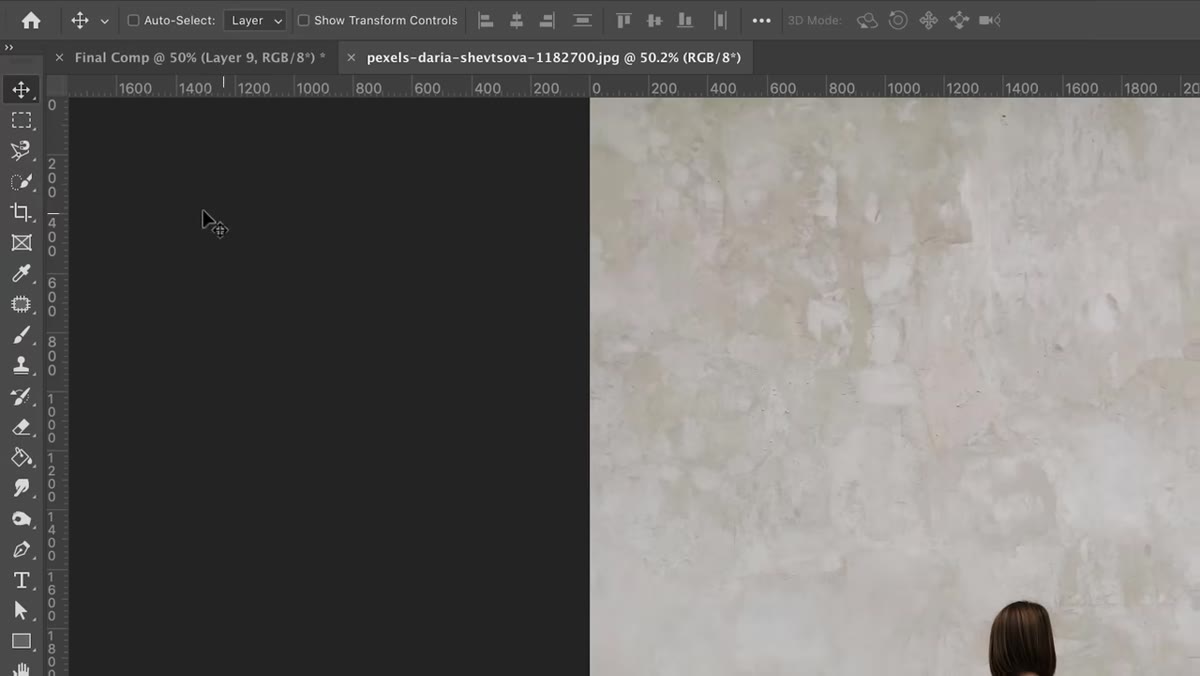 Quick Selection tool active, subject selected with marching ants visible
With the base image open in Photoshop, use the Quick Selection tool and hit “Select Subject” in the top options bar. In recent versions of Photoshop, the AI behind that button is genuinely good. It won’t be perfect at the edges, particularly around hair or loose fabric, but it gets you 90% there fast. Once the initial selection is made, go to “Select and Mask” to refine. Inside that workspace, use the Refine Edge brush along any areas where the mask is eating into the subject or leaving background fringe. Hold Alt (Option on Mac) while brushing to subtract from the mask instead of adding. Work the edges methodically, not all at once.
Quick Selection tool active, subject selected with marching ants visible
With the base image open in Photoshop, use the Quick Selection tool and hit “Select Subject” in the top options bar. In recent versions of Photoshop, the AI behind that button is genuinely good. It won’t be perfect at the edges, particularly around hair or loose fabric, but it gets you 90% there fast. Once the initial selection is made, go to “Select and Mask” to refine. Inside that workspace, use the Refine Edge brush along any areas where the mask is eating into the subject or leaving background fringe. Hold Alt (Option on Mac) while brushing to subtract from the mask instead of adding. Work the edges methodically, not all at once.
When you’re satisfied, set the output to “New Layer with Layer Mask.” This is non-destructive, meaning the original pixel data stays intact. If you make a mask mistake later, you paint white to reveal and black to conceal, right on the mask thumbnail. I never flatten a mask until a file is fully approved. That habit has saved me more than once.
Step 3: Cut the Hole in the Wall
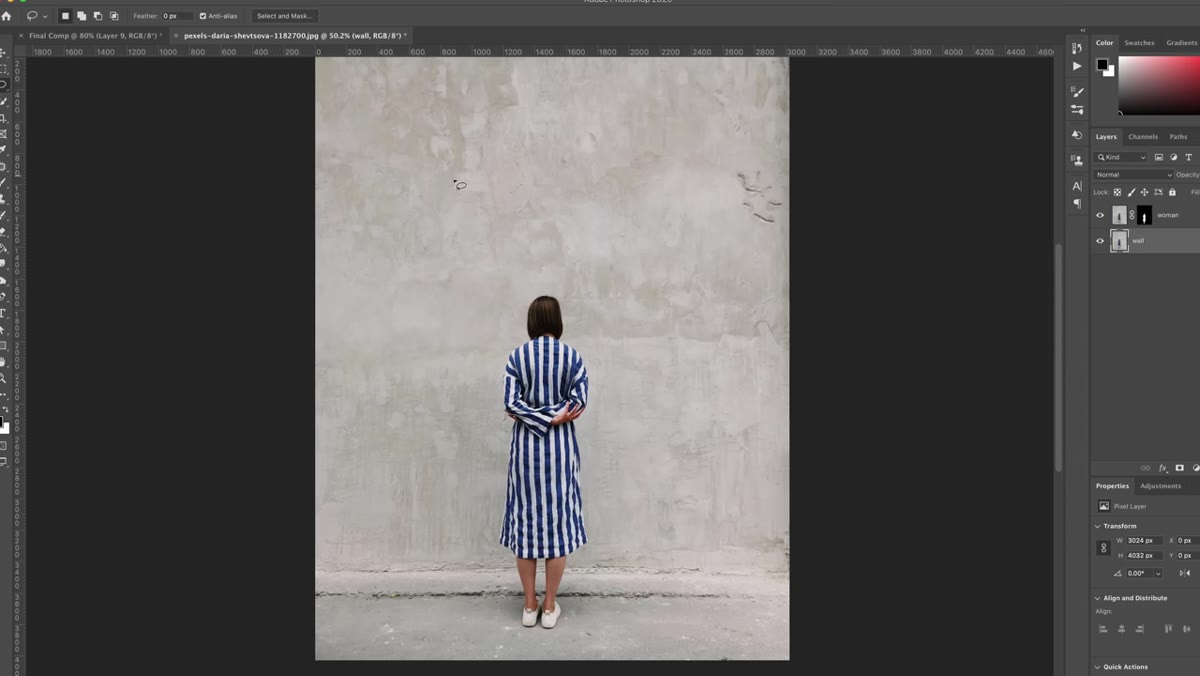 Lasso tool drawing an irregular hole shape on the wall layer
Select the wall layer and use the Lasso tool to draw the shape of your hole. Make it irregular, concrete doesn’t break in clean geometric shapes. Think about where stress fractures would radiate from the edges. The tutorial moves through this quickly, but the shape of this hole is doing a lot of narrative work. A sloppy oval reads as a cutout. An asymmetric, jagged shape reads as something that was punched through.
Lasso tool drawing an irregular hole shape on the wall layer
Select the wall layer and use the Lasso tool to draw the shape of your hole. Make it irregular, concrete doesn’t break in clean geometric shapes. Think about where stress fractures would radiate from the edges. The tutorial moves through this quickly, but the shape of this hole is doing a lot of narrative work. A sloppy oval reads as a cutout. An asymmetric, jagged shape reads as something that was punched through.
Once you have the selection drawn, invert it by going to Select > Inverse. This tells Photoshop you want to keep everything except the hole. Then add a layer mask by clicking the mask icon at the bottom of the Layers panel. The wall remains intact, and the hole is now transparent, ready for the world behind it.
Step 4: Place the Background World
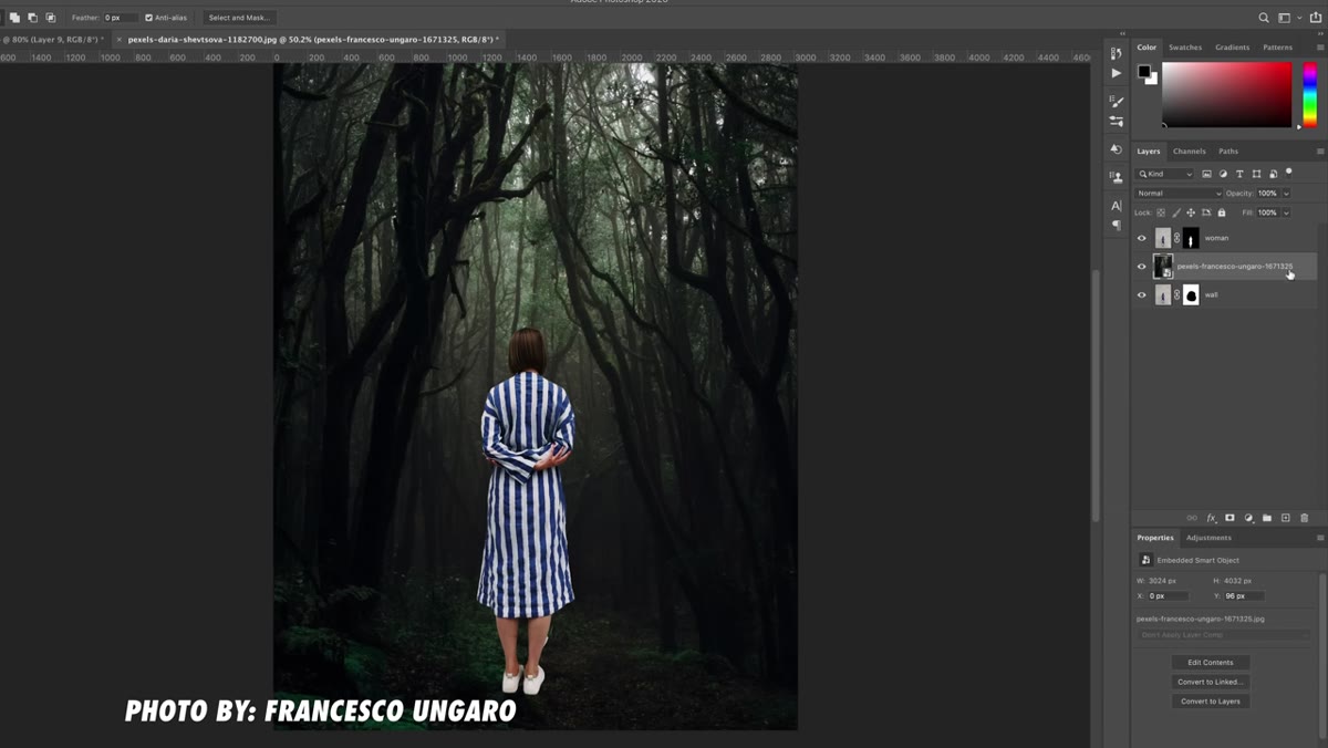 Forest photo layer dragged below the wall layer in the Layers panel
Bring your second image, the forest, into the document and drag the layer below the wall layer in the panel stack. Scale and position it so it fills the hole convincingly. Pay attention to the horizon line. If the forest’s horizon sits lower than the wall’s eye level, the perspective breaks and the image feels like a bad collage instead of a window. Match those horizon lines as closely as your images allow. You can nudge the forest layer around freely at this stage since nothing is committed yet.
Forest photo layer dragged below the wall layer in the Layers panel
Bring your second image, the forest, into the document and drag the layer below the wall layer in the panel stack. Scale and position it so it fills the hole convincingly. Pay attention to the horizon line. If the forest’s horizon sits lower than the wall’s eye level, the perspective breaks and the image feels like a bad collage instead of a window. Match those horizon lines as closely as your images allow. You can nudge the forest layer around freely at this stage since nothing is committed yet.
Step 5: Add Depth and Realism to the Hole Edges
 Wall hole visible with flat edges, no cracks or dimensional detail yet
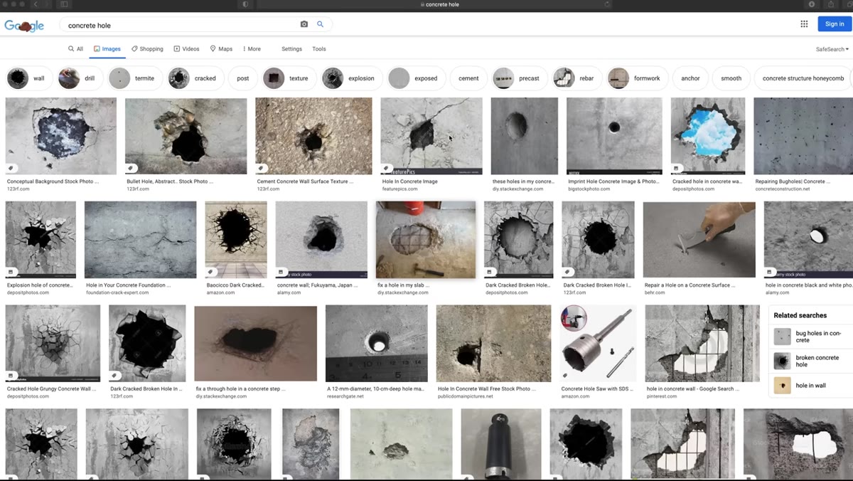
This is where the tutorial delivers its most important insight, and it’s the step that separates composites that fool the eye from ones that don’t. A real hole in concrete would have cracks extending outward from the break, rough crumbling edges, and possibly a shadow cast inward toward the background layer. Mango Street addresses this directly: without those physical details, the hole reads as a digital cutout because that’s exactly what it is.
Wall hole visible with flat edges, no cracks or dimensional detail yet
This is where the tutorial delivers its most important insight, and it’s the step that separates composites that fool the eye from ones that don’t. A real hole in concrete would have cracks extending outward from the break, rough crumbling edges, and possibly a shadow cast inward toward the background layer. Mango Street addresses this directly: without those physical details, the hole reads as a digital cutout because that’s exactly what it is.
To sell the depth, you can paint crack details on a new layer using a hard brush set to low opacity and a dark neutral color, building up slowly. Add a thin inner shadow along the hole’s edge using a soft dark brush on a layer clipped above the wall. These additions are small in terms of actual pixel work, but they carry the weight of convincing the viewer that what they’re looking at is structural, not manufactured.
What I’d Do Differently After Doing This at Scale
The Mango Street approach is clean and well-suited to a first composite like this. One thing I’d add from my own workflow: I sketch the composite on paper before opening Photoshop. Even a two-minute rough thumbnail forces me to make decisions about where the light source lives, how large the hole should be relative to the figure, and whether the figure is meant to block the hole or frame it. Digital tools make it too easy to move things around indefinitely. A sketch creates a target. Without one, I’ve watched myself chase a “better” version of an image for hours longer than the job warranted.
I’d also add a unified color grade as a final step using a single adjustment layer at the top of the stack, something that pushes both the wall and the forest toward a shared tone. Two photos from two different shoots will always have a color seam. A curves layer with a slight warm push in the midtones tends to glue environments together quickly.
The core lesson here is that believable compositing is a physical argument. Every element in your image needs to obey the same laws of light, perspective, and material reality, or the viewer’s brain will flag it even if they can’t articulate why. Nail those rules, then break them deliberately, and you can build images that feel genuinely impossible.
Watch the full tutorial on YouTube and follow along with the original assets Mango Street links in the description.
Comments (2)
The tip about breaking reality how to compos was the missing piece for me. Thank you.
I tried this on a client project yesterday and the results were way better than expected.
Leave a Comment